Preview image. Unlock full-res
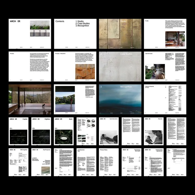
Multi-page architecture and design brand system showcasing modular layouts, earthy tones, environmental photography, and systematic typography on a grid of guideline pages.
Summary
An architecture and sustainability-focused brand system displayed across a grid of guideline pages, balancing content-heavy specs with breathing room through modular layout and environmental imagery.
Visual description
A densely tiled grid of approximately 20 pages arranged on black background, each showcasing different sections of a comprehensive brand guidelines. Pages mix full-bleed environmental photography (concrete details, exterior views, landscape vistas in muted blues and warm earth tones) with type-focused spreads using white space, dense body text in small sans-serif, and minimal ornament. A consistent modular grid structures each page; some pages are image-dominant while others are text-only. Imagery depicts built environments, natural materials, and landscape. Consistent use of tight letterspacing and minimal margins creates a technical, architectural tone. The overall palette is neutral and warm: off-whites, warm beige, warm grays, and touches of muted slate blue.
Key takeaway
The strategic alternation between image-heavy and text-heavy pages preventing guideline fatigue; the warm, natural earth-tone palette suggesting sustainability and craftsmanship; the tight grid and minimal margins creating density without illegibility; the integration of photography as a texture throughout, not as decoration.
Reuse notes
Ideal for architecture, design, or heritage brands where environmental context and material authenticity matter. The muted, warm palette reads as upscale and considered; works especially well when paired with a restrained sans-serif and generous body margins. The page structure is print-optimized but translates well to digital PDF galleries.
More like this



Keep what you find
A free account saves references to boards and can send you a weekly email of picks based on what you save.
To see every result, go Pro.