Preview image. Unlock full-res
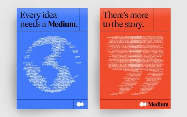
Two paired posters for Medium, one blue with a globe shaped from tiny words and one orange with giant quotation marks made of text, joined by a serif-and-sans headline lockup.
Summary
A two-poster Medium campaign where the central imagery is built entirely from type: a globe assembled from tiny scattered words on a blue poster, and a pair of giant quotation marks formed from text on an orange poster.
Visual description
Two portrait posters sit side by side on a light grey surface. The left poster is saturated cobalt blue: a top-left headline reads "Every idea needs a Medium." in white, mixing a serif for "Every idea needs a" with a bold serif emphasis on the word "Medium", and below it a globe shape is rendered out of hundreds of small scattered words rather than a solid illustration. The right poster is bright orange-red with the same complementary energy: the headline "There's more to the story." sits top-left, and the body of the poster forms two oversized quotation marks again constructed from clustered tiny words. Each poster carries a thin rule boxing off the top-right corner and the black Medium wordmark with its two-circle logo locked to the bottom edge. The blue/orange complementary pairing and the shared layout grid bind the two as a set.
Key takeaway
Type-as-image: building a recognizable icon (a globe, quotation marks) out of the brand's own small body copy turns a flat poster into a portrait of "lots of writing" without any illustration. The complementary blue/orange split plus an identical grid is what makes two posters read as one campaign.
Reuse notes
Reach for this when a content or publishing brand needs poster or social assets that feel like ideas made visible. Best deployed as a series, since the payoff is the repeated layout with swapped color and swapped type-shape. Requires enough real copy to fill the silhouette legibly at the chosen size.
More like this

Keep what you find
A free account saves references to boards and can send you a weekly email of picks based on what you save.
To see every result, go Pro.