Preview image. Unlock full-res
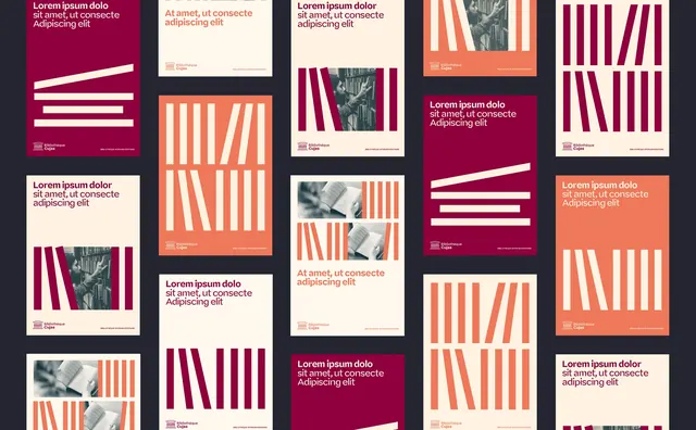
A flexible poster template system in maroon, coral, and cream where vertical and angled stripe blocks act as a recurring barcode-like motif behind placeholder headlines and small grayscale photos.
Summary
A poster template system held together by one repeating motif: clusters of uneven vertical stripes that read like a barcode, recolored and re-angled across maroon, coral, and cream panels. The system shows how a single abstract mark can drive a whole layout grid while keeping headlines and photos interchangeable.
Visual description
A dark charcoal canvas holds roughly sixteen poster variants in a tidy multi-column grid. Each poster is one of three flat fields, deep maroon, coral orange, or warm cream, carrying a block of thin vertical or slightly fanned stripes in a contrasting tint (cream stripes on maroon, maroon on coral, coral on cream). Placeholder headlines set in a small serif read "Lorem ipsum dolor / sit amet, ut consecte / Adipiscing elit," paired with a tiny stacked sans-serif logo lockup and footer text. A few cells swap the stripes for small black-and-white photographs of figures, keeping the same proportions. The striping varies pose and density poster to poster while the palette and type stay fixed.
Key takeaway
Reduce a brand mark to a simple, repeatable graphic (here, fanned stripes) and treat it as a layout engine: vary its scale, angle, and color per poster while everything else stays locked. Constrain the whole set to a three-color warm palette and one type pairing so dozens of variants still read as one family. Mixing in occasional grayscale photos at the same frame size keeps the system from feeling purely abstract.
Reuse notes
A good template reference for a festival, publisher, or cultural program that needs many on-brand posters generated quickly. The barcode-stripe device scales to social tiles and covers as easily as print. Keep the palette tight; adding more colors would dilute the family resemblance that makes the system work.
More like this





Keep what you find
A free account saves references to boards and can send you a weekly email of picks based on what you save.
To see every result, go Pro.