Preview image. Unlock full-res
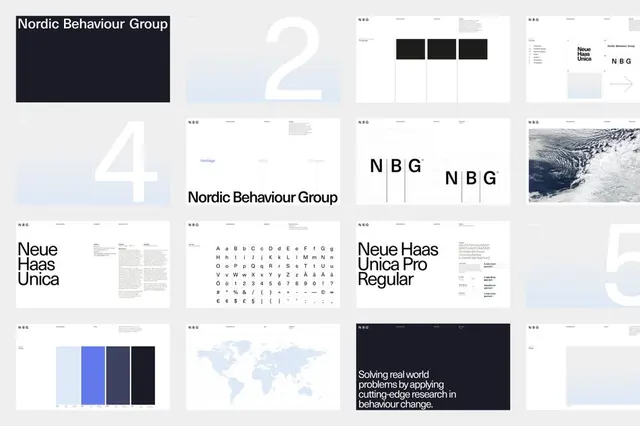
A contact-sheet grid of brand-guideline pages for Nordic Behaviour Group, alternating Neue Haas Unica type specimens, oversized page numbers, and pale-blue swatches over a strict modular grid.
Summary
A fifteen-cell contact sheet of brand-guideline spreads for Nordic Behaviour Group, shown as thumbnails so the system reads as one rhythm: type specimens, giant page numbers, NBG monograms, and pale-blue color blocks all sitting on the same grid.
Visual description
The image arranges roughly fifteen guideline pages in a regular grid against white. Recurring page types repeat across the cells: the Nordic Behaviour Group wordmark on a near-black cover, enormous light-grey numerals (2, 4, 5) bleeding off the page edge, NBG monogram lockups, and a full Neue Haas Unica character set laid out as a glyph chart. Color appears only as restrained pale-blue and indigo swatch blocks and a single arctic ocean photograph. A dark closing page sets a justified mission statement in white. Every page shares the same tiny running header and wide margins, so the set looks like one continuous document.
Key takeaway
Presenting a brand system as a thumbnail contact sheet, rather than one hero page, sells the consistency itself as the idea. The oversized bleeding page numbers act as section dividers and decoration at once, carrying visual weight without any added graphics.
Reuse notes
A clean template for consultancy, research, or behavioural-science identities that need to feel rigorous and quiet. Works best when the typeface can carry the whole system, since color is deliberately minimal, so choose a neutral grotesque with a full glyph range.
More like this




Keep what you find
A free account saves references to boards and can send you a weekly email of picks based on what you save.
To see every result, go Pro.