Preview image. Unlock full-res
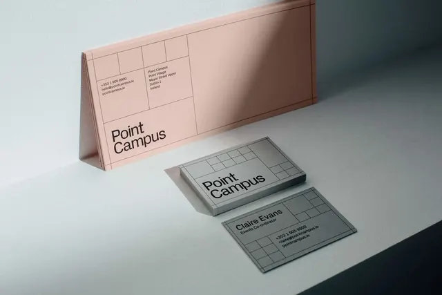
Minimal identity set with Point Campus wordmark rendered as stacked sans-serif type on grid-patterned business cards, envelope flap, and folder in warm neutral palette.
Summary
Minimal identity system with Point Campus stacked sans-serif wordmark on a soft pink color field, deployed across business cards and envelope pieces in a typographic grid layout.
Visual description
Three stationery items are arranged diagonally on a neutral white surface. A tall folded envelope flap displays the Point Campus wordmark stacked over two lines at full scale, with contact information and postal address in small sans-serif at the top. Two business cards below layer horizontally, the top card repeating the stacked wordmark and the second showing "Claire Evans" and business details. All pieces share the same grid pattern printed as thin rules in dark gray. The color palette is restrained: warm light pink as the primary field, dark charcoal-gray for text, with subtle shadows cast by the card edges.
Key takeaway
The stacked wordmark structure that breaks the name into two clear typographic lines while maintaining perfect legibility. The grid backdrop is subtle but gives every piece a sense of measured composition and technical sophistication. The muted warm palette (light pink, gray) feels contemporary and professional without aggression. The diagonal arrangement of three pieces in one shot demonstrates system cohesion.
Reuse notes
Perfect for professional services, tech startups, nonprofits, or educational institutions seeking understated elegance. The stacked format works well for names 2-3 words. Soft pink pairs particularly well with cool grays and is effective in B2B contexts where femininity and warmth signal approachability. Avoid over-scaling; the system's strength lies in restraint and proportional type.
More like this



Keep what you find
A free account saves references to boards and can send you a weekly email of picks based on what you save.
To see every result, go Pro.