Preview image. Unlock full-res
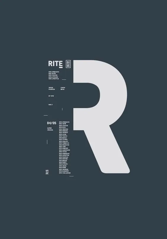
A slate-grey poster anchored by one oversized light-grey letter R, with the RITE logo and dense ranked micro-text columns laddered down the left edge.
Summary
A portrait poster on slate blue-grey dominated by a single huge light-grey letter R, with the RITE wordmark, a 04/05 index, and tightly stacked columns of tiny all-caps text running down the left side.
Visual description
The ground is a muted charcoal-slate. Filling the right two-thirds is one enormous R in a light grey geometric sans, set so large its bowl and leg define the negative space. Down the left edge, a strict left-aligned column carries the RITE logo locked beside a small boxed 04/05, then several short stacked label pairs, and lower down a long ranked list of repeating RITE-prefixed micro phrases set in pale grey caps. Thin tick-marks and a small mark near the bottom act as registration details. Everything tiny is pinned to one vertical axis, leaving the giant R to hold the rest of the page.
Key takeaway
Let one display glyph occupy most of the canvas and treat all functional copy as a single narrow column of micro-type beside it. The size jump from monumental letter to near-caption text is the whole hierarchy, no mid-sizes needed. The boxed index number and tick-marks add a systematized, catalogue feel cheaply.
Reuse notes
A strong template for a brand poster, lookbook divider, or numbered series where each piece foregrounds one initial. The tight monochrome and grid read as serious and editorial, so it suits fashion, type foundries, and design studios. Needs disciplined alignment; the dense left list only works if every line snaps to the same axis.
More like this





Keep what you find
A free account saves references to boards and can send you a weekly email of picks based on what you save.
To see every result, go Pro.