Preview image. Unlock full-res
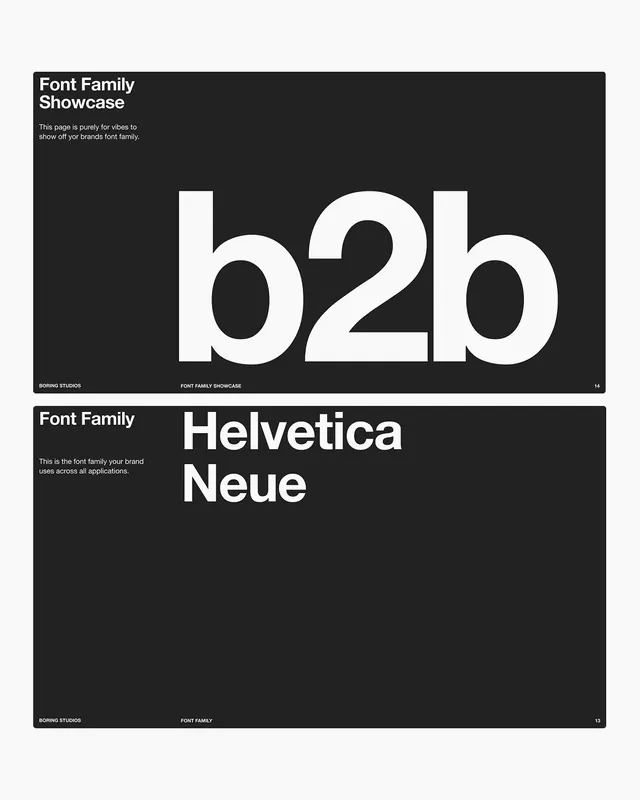
Two stacked brand-guideline pages showing a font-family showcase, an oversized b2b glyph trio and a Helvetica Neue heading, in white-on-near-black Swiss style.
Summary
Two near-black brand-guideline pages stacked on a light grey board, both dedicated to the brand's typeface. One blows up a "b2b" glyph trio, the other names the family as Helvetica Neue, in strict Swiss-grid layout.
Visual description
Each page is a wide dark-charcoal rectangle on a pale background. The top page is headed "Font Family Showcase" in bold white sans at upper-left with a short caption beneath, and is dominated by an enormous lowercase "b2b" set in heavy white grotesque that nearly spans the page; the rounded bowls and tight spacing make the trio read as one mass. A thin white rule along the bottom carries a "BORING STUDIOS" left label, a center caption, and the page number 14. The lower page repeats the format: "Font Family" header, a caption, and a large two-line "Helvetica Neue" heading, footer numbered 13. Both lean on left-aligned text, a baseline footer rule, and uncompromising white-on-near-black contrast.
Key takeaway
Treating a single typeface as the hero image, blowing the glyphs up until counters and spacing become the composition, turns a dry spec page into a poster. The persistent footer rule with left label, center caption and right page number is a clean system that keeps a multi-page deck coherent.
Reuse notes
A dependable layout for the typography section of any brand or design-system deck, especially a self-aware "boring is good" studio voice. The dark ground and grotesque pairing suit b2b, agency, or developer-tool brands. Keep the glyph blow-up to one weight so the showcase stays about the type, not the color.
More like this






Keep what you find
A free account saves references to boards and can send you a weekly email of picks based on what you save.
To see every result, go Pro.