Preview image. Unlock full-res
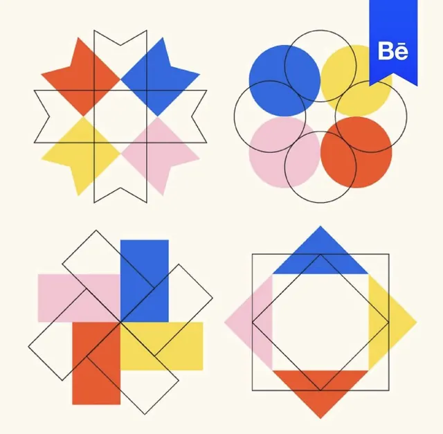
Four-up grid of radial geometric logo studies that overlap squares and circles in primary blue, red, yellow and pink with thin outline construction lines.
Summary
Four radially symmetric logo studies arranged in a two-by-two grid on cream, each built by rotating and overlapping squares or circles in primary blue, red, yellow and pink, with thin black outlines showing the construction geometry.
Visual description
A cream ground holds four distinct marks in quadrants, all sharing the same palette of cobalt blue, tomato red, sun yellow and soft pink. Top-left is an eight-point star made of interlocking color triangles over an outlined zigzag. Top-right is a flower of overlapping translucent circles where outlines and fills shift hue in their overlaps. Bottom-left is a pinwheel of rotated rectangles spinning around a center, half filled in color, half left as outline. Bottom-right is a square rotated inside a square, its four triangular corners each carrying one color. A small blue Behance ribbon tag sits in the top-right corner of the canvas.
Key takeaway
Generating a whole family of marks from one rule, rotating a single primitive around a center, so the set feels systematic while each result looks different. Leaving some shapes as thin outlines and filling others builds depth and shows the underlying grid without extra elements; translucent overlaps let the four colors create new tones for free.
Reuse notes
A strong reference when you need a flexible, geometric brand system with a built-in pattern language rather than a single fixed logo. The Mondrian-style primaries read playful and confident, well suited to media, education, or creative brands. Note the Behance ribbon is a gallery overlay, not part of the artwork.