Preview image. Unlock full-res
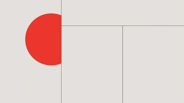
Minimalist geometric mark combining a bold red semicircle with a neutral beige background bisected by black grid lines into distinct rectangular zones.
Summary
Minimalist geometric mark combining a bold red semicircle with a neutral beige background bisected by black grid lines into distinct rectangular zones.
Visual description
Composition divided by intersecting vertical and horizontal black lines creating a nine-square grid. Upper left quadrant occupied by a confident red semicircle (or quarter circle) that breaks the grid boundary, left-aligned and rising to fill roughly the upper-left half of the canvas. Remaining zones are clean beige, with no additional imagery or ornament. The grid lines are consistent stroke weight, creating clear structural rhythm that contrasts sharply against the monochromatic ground and the vibrant red shape.
Key takeaway
The geometric shape (red semicircle) works as a distinctive mark precisely because it violates the strict grid organization, creating tension between order and organic form. The minimal palette (three values: beige, gray lines, red) makes the color pop without visual noise. The intersecting grid adds sophistication without becoming decorative.
Reuse notes
Effective for architecture, real-estate, or design-focused brands needing a contemporary mark. Works as a standalone icon or as part of a larger brand system where the red accent color can be leveraged elsewhere. The grid structure suggests modularity, making it suitable for applications requiring pattern variations or system thinking.