Preview image. Unlock full-res
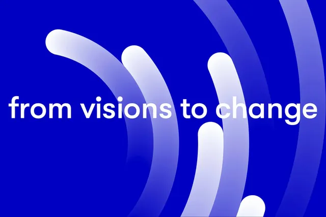
Minimalist logo mark with three overlapping curved white and lavender wave shapes flowing diagonally on deep blue background, paired with white lowercase sans-serif text 'from visions to change.
Summary
Minimalist identity combining three flowing white-to-lavender gradient wave shapes with white sans-serif tagline on deep blue background, conveying transformation and forward momentum.
Visual description
Deep cobalt-blue full-frame background. Three abstract curved shapes flowing diagonally from lower-left to upper-right, each a white-to-lavender gradient that creates depth and rhythm. The shapes overlap slightly, suggesting layers or progression. White sans-serif lowercase text "from visions to change" sits centered in the lower-middle area, clean and modern. The curves are organic and fluid yet geometric, avoiding naturalism. The overall composition is balanced and spacious, with ample negative blue space allowing the mark and message to breathe and feel premium.
Key takeaway
Gradient wave shapes serve as both visual identity and metaphor for transformation or progress. The vertical rhythm of overlapping curves creates movement without animation. Use this for: consulting or strategy firms, nonprofits, or B2B SaaS companies needing to signal innovation and human-centered change.
Reuse notes
Pairs well with minimal website layouts and modern sans-serif typography. The deep blue grounds the design professionally while the gradient waves add visual interest and optimism. Suitable for: pitch decks, annual reports, corporate websites, and internal communications. The white-on-blue reads well on screen and in print; test gradient rendering across different contexts. Works at any scale.