Preview image. Unlock full-res
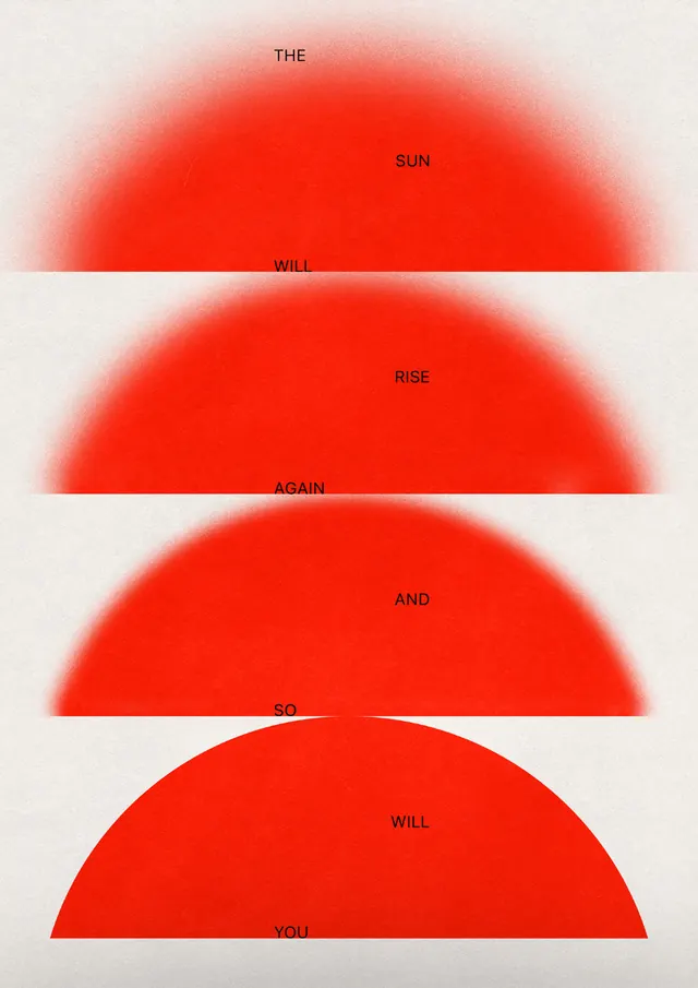
Four concentric arc shapes in graduated warm reds, each labeled with a single word, stacked vertically to resemble a rising or setting sun, against a light neutral background.
Summary
Minimalist graphic system using four concentric semicircular arcs in warm-red gradients, each labeled with a single semantic word, stacked to form a stylized sunrise or energy progression.
Visual description
Light beige background. Four distinct red arc shapes (semicircles viewed from above) are stacked vertically, each progressively smaller and darker in hue, creating a sense of depth or sequence. The topmost arc (lightest, peachy-red) is labeled "THE", the second "SUN", the third "FOR", and the bottom (most saturated, deepest red) "YOU". Each word is positioned above its corresponding arc in small black sans-serif text. The gaps between arcs are white background space, emphasizing the clean geometric separation and the gradient effect.
Key takeaway
The use of concentric arcs and graduated color intensity to suggest movement, growth, or energy without realistic rendering. The pairing of abstract shape language with literal semantic labels creates cognitive interest and invites interpretation. This system is endlessly extensible by rotating, stacking, or repeating the arc units, making it modular and brand-scalable.
Reuse notes
Effective for sustainability, environmental, or energy-focused brands, or any identity needing warmth and forward motion. The geometric simplicity works across scales from small logo lockup to large poster. The labeling technique allows for narrative or sequential information. Gradients may need adjustment for small-scale reproduction, but the arc framework is purely vector-based and infinitely precise.
More like this
Keep what you find
A free account saves references to boards and can send you a weekly email of picks based on what you save.
To see every result, go Pro.