Preview image. Unlock full-res
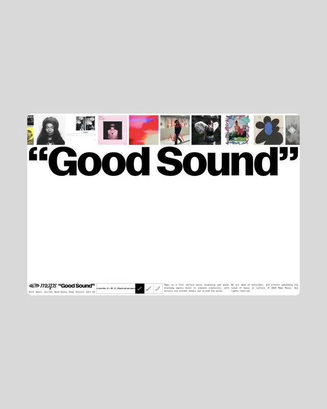
Website hero for Maps music agency, with a giant black quoted headline Good Sound under a single row of small album-cover thumbnails on a clean light-grey ground.
Summary
A web hero layout for the music-licensing agency Maps: a single horizontal strip of small album-cover thumbnails sits directly above a huge black quoted headline reading "Good Sound", all on a white card floating in a light-grey browser frame.
Visual description
The artboard is a rounded white panel on a soft grey background. Near the vertical center, a tight row of about a dozen small rectangular album/photo thumbnails runs edge to edge, a mix of portraits, abstract art, and record sleeves, forming a thin collage band. Immediately below, the page's only large element is the phrase "Good Sound" set in a massive bold grotesk with the words wrapped in oversized curly quotation marks, dominating the lower third in solid black. Most of the panel is intentionally empty white space. A bottom utility row holds the Maps logo and the same "Good Sound" quote in small type, a left-aligned nav (Work, About, Journal, Good Space, Shop, Contact, Cart), a tiny monospaced news ticker, and two columns of small footer copy describing Maps as a full-service music licensing and audio branding agency. A couple of the thumbnails carry small red type accents.
Key takeaway
Use a thin strip of real content thumbnails as the only "image," then let one enormous quoted headline carry the entire page; the contrast between the busy little collage row and the giant calm headline does all the work. Wrapping the headline in literal big quotation marks turns a two-word phrase into a brand statement.
Reuse notes
A strong reference for agency, studio, label, or portfolio landing pages that want to feel editorial and confident with almost no imagery. The thumbnail-strip-plus-mega-quote pattern pairs well with a minimal utility footer and monospaced micro-copy. Works best with abundant white space and a genuinely good display grotesk; it falls flat if the headline phrase is weak or the thumbnails are low quality.
More like this






Keep what you find
A free account saves references to boards and can send you a weekly email of picks based on what you save.
To see every result, go Pro.