Preview image. Unlock full-res
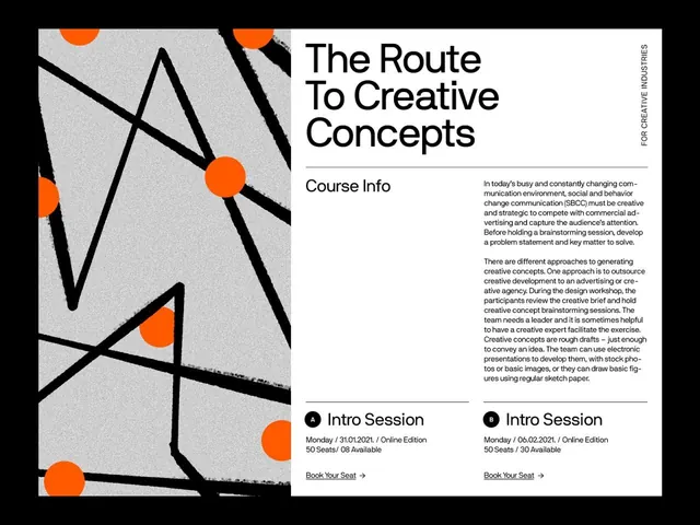
Split-screen course promo pairing an abstract grey panel of black brush strokes and orange dots with a clean grotesque headline and two-column session listing.
Summary
A course-promo layout split down the middle: a grey graphic panel of black painterly strokes punctuated by solid orange dots on the left, and a structured white text column on the right. The lone warm accent against an otherwise monochrome page is the defining move.
Visual description
The left half is a grey-textured field crossed by rough black brush or tape strokes that zigzag like a mountain range, with several flat orange circles dropped at the intersections. The right half is white and tightly gridded: a three-line headline set in a heavy grotesque sans, a "Course Info" subhead, two columns of justified body copy, and at the bottom two "Intro Session" entries marked A and B inside small black circles, each with a date, seat count, and an underlined "Book Your Seat" link with an arrow. A rotated vertical caption reading along the right edge anchors the corner. Hairline rules separate every block.
Key takeaway
The single-accent discipline: one saturated orange against grey, black, and white reads as deliberate, not decorative. Also the A/B session pattern, two identical mini-cards distinguished only by a circled letter and an arrowed link, which makes a list of dates feel like a designed component.
Reuse notes
Strong template for workshop, course, or event landing sections where you need to show copy and bookable sessions side by side. The painterly panel is interchangeable with any abstract or photographic block, so the right-hand grid carries the system. Keep the accent count to one for the contrast to hold.
More like this




Keep what you find
A free account saves references to boards and can send you a weekly email of picks based on what you save.
To see every result, go Pro.