
Preview image. Unlock full-res
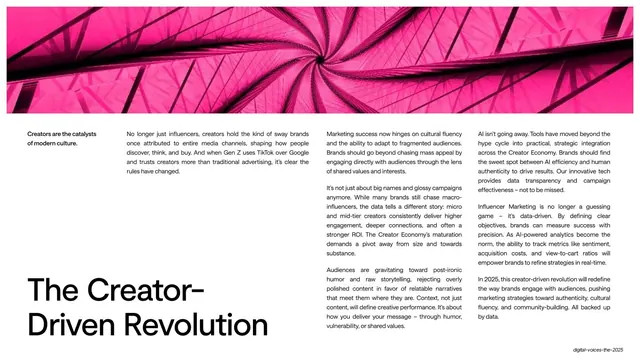
A 52-slide influencer-marketing trend report that alternates near-black big-type section slides with white editorial content pages, built on oversized grotesque headlines, a Swiss utility header, and bright accent colors reserved for data.
Summary
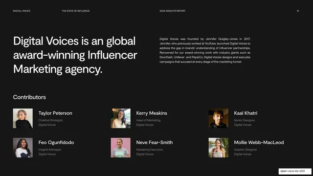
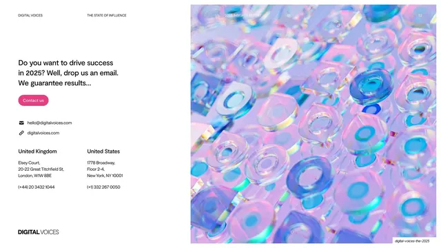
A 52-slide influencer-marketing trend report from agency Digital Voices ("The State of Influence 2025"). Its identity comes from three moves: alternating near-black big-type section slides with bright-white editorial content pages, oversized grotesque headlines used as the layout itself, and a consistent Swiss utility header that runs across the top of nearly every slide.
Visual description
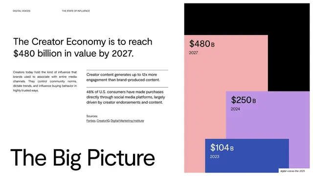
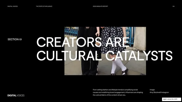
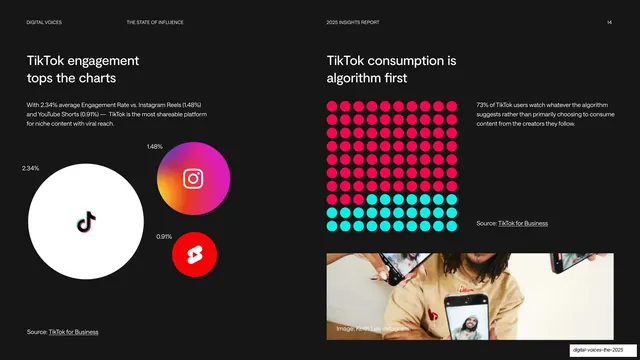
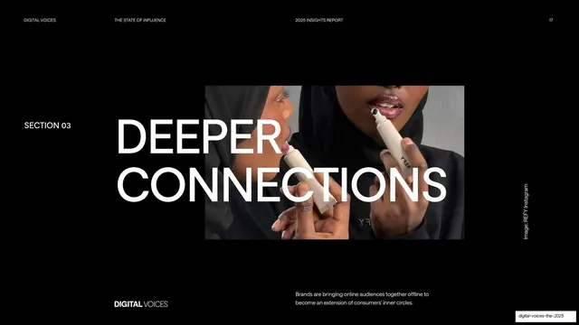
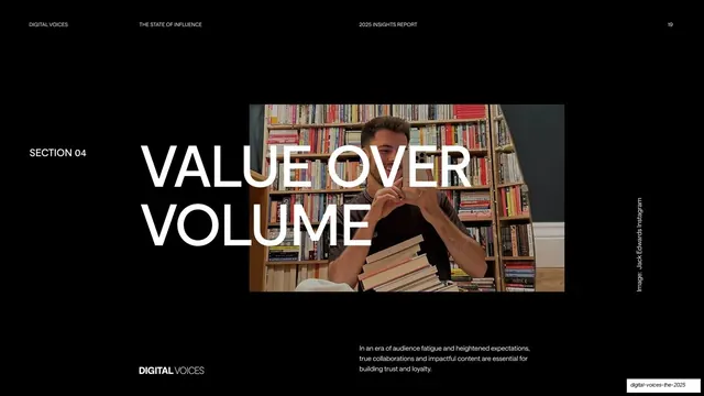
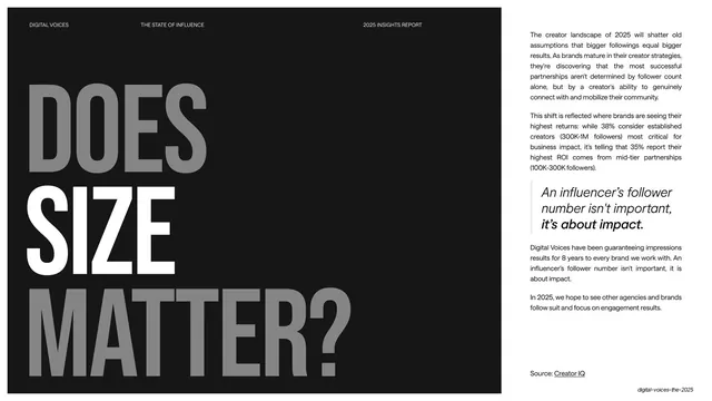
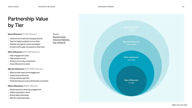
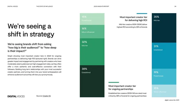
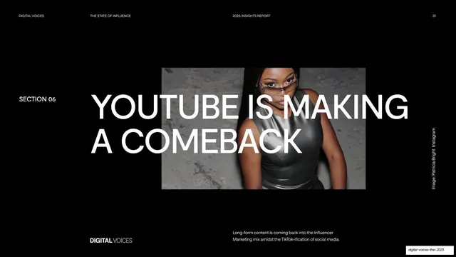
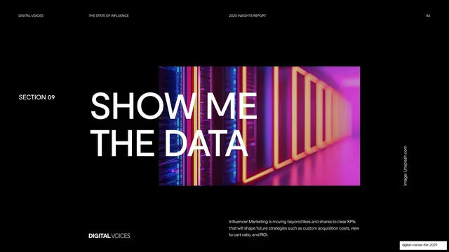
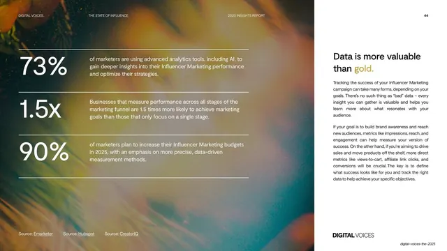
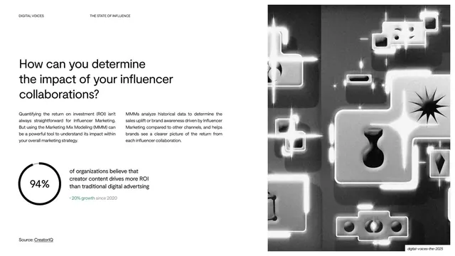
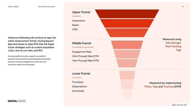
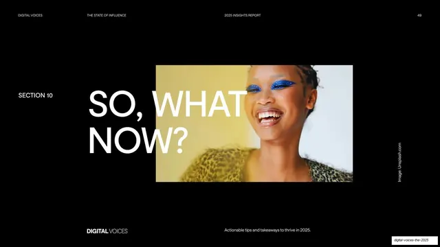
Slides are 16:9. The deck swaps between two systems. Dark slides (near-black #0A0A0A) carry covers, section dividers, statements, and type-walls, all set in heavy white grotesque caps so large the words break across lines and the type becomes the grid; section dividers add a small "SECTION 0X" tag and lay one centered photo behind the headline. Light slides (white #FFFFFF) carry the analytical content: an oversized headline (often lowercase, sometimes mixing roman and italic for emphasis), one or two justified body columns of small text, a captioned photo, and frequently a single big stat on a hairline rule. Bright accent colors are held back almost entirely for data visualization: coral/pink (#FF1F4B), lilac (#C09BE8), royal blue (#3C53C8), green (#2EA161), cyan (#1FE0D0), and orange, appearing in overlapping block charts, descending colored-bar staircases, proportional platform-logo bubbles, and two-color dot grids.
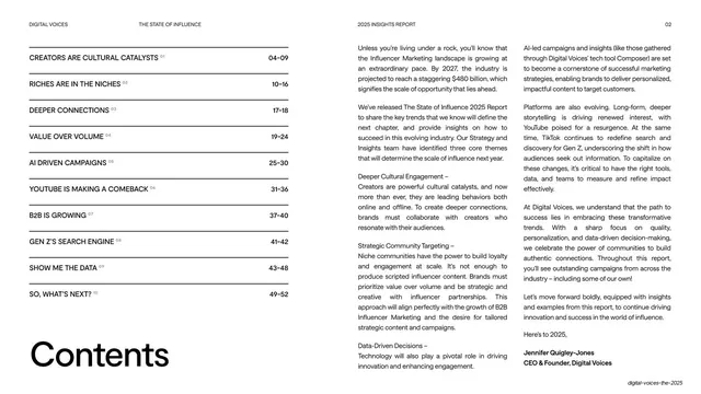
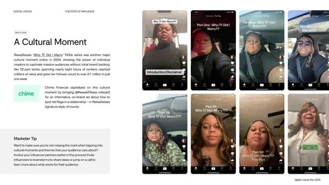
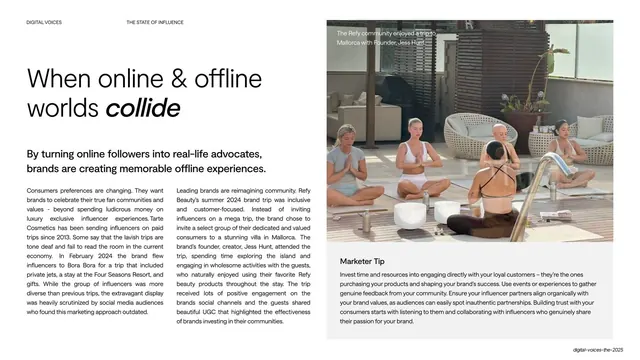
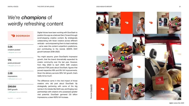
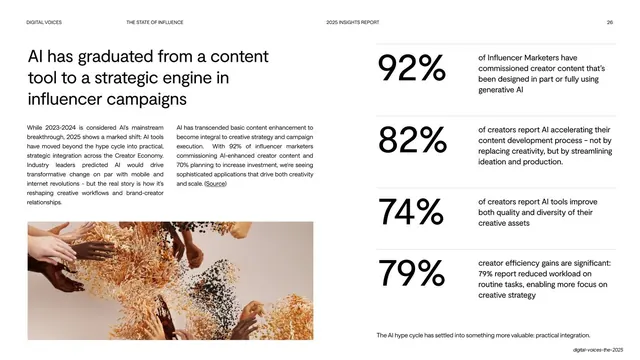
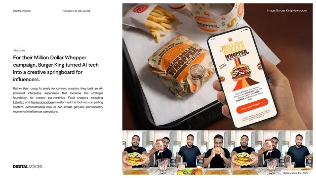
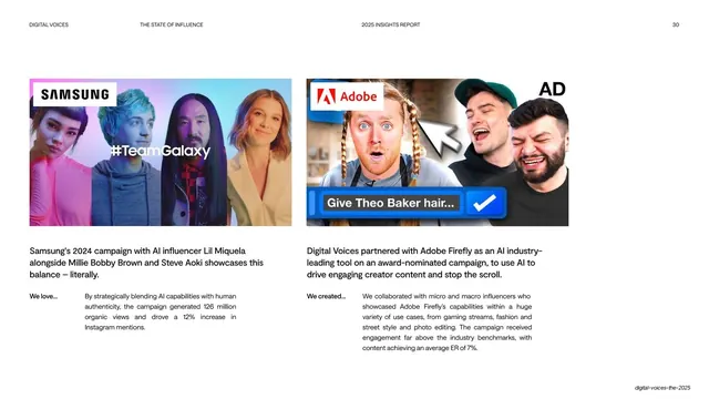
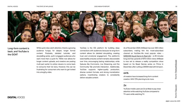
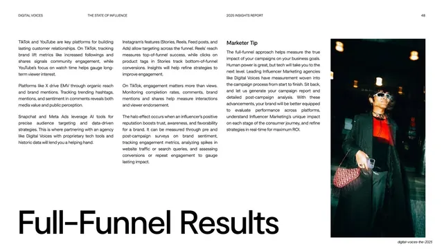
Recurring grammar across the deck: a thin top utility header (DIGITAL VOICES left, THE STATE OF INFLUENCE and 2025 INSIGHTS REPORT center, a two-digit page number right); a "DIGITAL VOICES" wordmark on dark slides; oversized lowercase "footer headlines" anchored to the bottom-left of content pages ("The Big Picture", "The Power of Niche", "Content first"); a dark charcoal "Marketer Tip" box pinned to the bottom of many content slides for the actionable takeaway; captions and image credits set in white over photos or rotated up a photo's right edge; and a repeated case-study pattern of body narrative plus a labeled three-metric stat row. Content draws on real social screenshots (TikTok videos, comment threads, phone-screen grids) and editorial creator photography.
Key takeaway
The alternating dark/light rhythm that paces a long report without decoration, switching the whole color world at each section. The discipline of one oversized headline per slide (caps on dark, lowercase on light) doing the layout work against tiny all-caps utility labels. And the strongest system idea: a fixed kit of reusable parts (utility header, section-divider template, oversized lowercase footer, dark Marketer Tip box, hairline-ruled stat call-out) recombined on every page, so 52 slides stay cohesive while each one differs. The data slides are worth stealing on their own: charts redrawn as colored staircases, overlapping blocks, logo bubbles, and dot grids keep numbers on-brand and instantly legible.
Reuse notes
A strong reference for trend reports, insight decks, and any long-form marketing or media report that must stay legible and branded across 40-plus slides. The section-divider template, the Marketer Tip box, the oversized lowercase footer, and the four data-viz patterns are each directly liftable. The dark/light alternation needs genuinely good creator photography to carry the section and statement slides. The big-type-as-layout approach depends on a heavy grotesque and short headlines; long copy breaks the scale. Accent colors work hardest when reserved for data, as they are here, against the otherwise black-and-white system.
From this deck: Digital Voices: The State of Influence 2025
View deck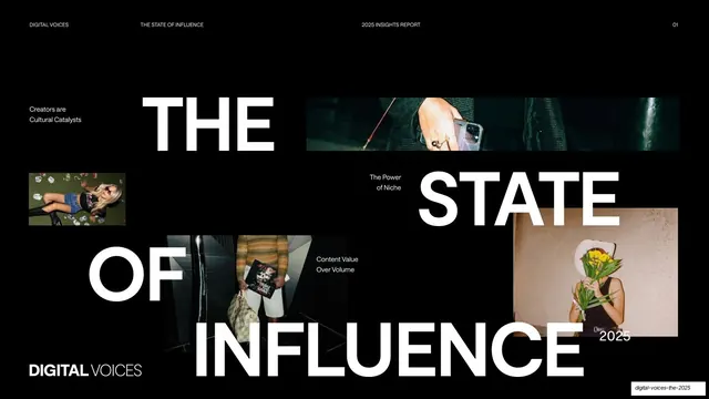








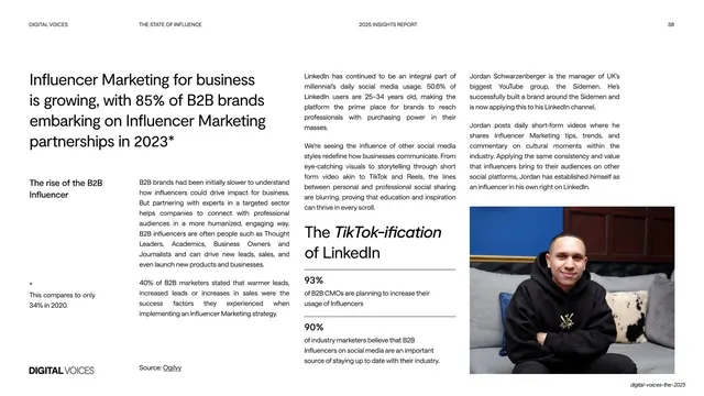
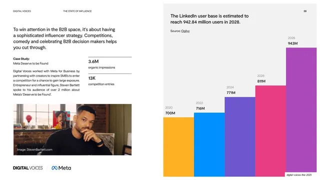
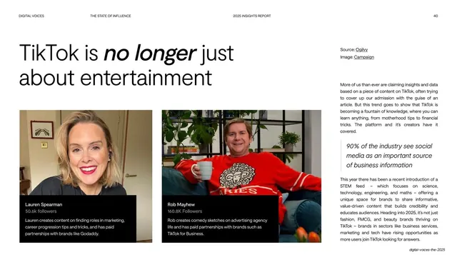
More like this









Keep what you find
A free account saves references to boards and can send you a weekly email of picks based on what you save.
To see every result, go Pro.