Preview image. Unlock full-res
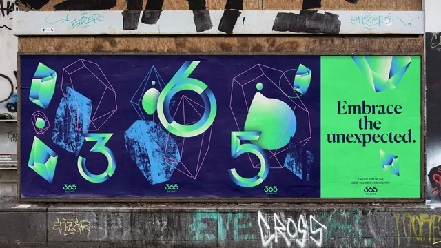
Four fly-posted panels on a graffitied hoarding, three navy sheets carrying oversized gradient 3, 6 and 5 numerals and a green sheet closing with the line "Embrace the unexpected.
More like this
See all

Summary
A run of pasted posters where the brand numerals 3, 6 and 5 each get their own navy sheet, and a single green sheet lands the line.
Visual description
Four sheets are pasted onto a timber hoarding, framed by graffiti above and below. The first three are deep navy. Each carries one oversized numeral drawn in a thin display face and filled with a green-to-blue gradient, surrounded by faceted crystal forms, thin pink and blue polygon wireframes, small gradient droplets, and rough blue mineral textures that look screen-printed. The fourth sheet is acid green and carries "Embrace the unexpected." in a heavy navy serif over three lines, with two small gradient gems floating at top and bottom right and a two-line all-caps footnote reading "IT MIGHT JUST BE THE EDGE YOU WERE LOOKING FOR." All four sheets are signed at the bottom with the stacked 365 TALENTS logo, green on the navy panels and navy on the green one.
Key takeaway
Splitting a three-digit brand name into three separate posters turns a sequential paste-up into the logo itself. The gem language is built from three stacked treatments (solid gradient facets, outline wireframes, textured mineral scans) so the same motif never repeats identically.
Reuse notes
Reach for this when a brand name is numeric or short enough to be broken across surfaces, or when a campaign needs to survive being pasted in an untidy urban context. The gradient artwork depends on a dark ground; the single green payoff panel is what stops the sequence reading as pure pattern.