Preview image. Unlock full-res
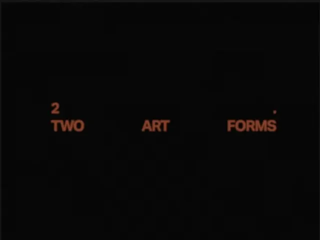
Sparse type frame with three rust-orange words 'TWO ART FORMS' spread across one line over near-black, numbered with a small superscript figure '2'.
Summary
A near-black title frame holding a single horizontal line of three rust-orange words, "TWO ART FORMS", widely spaced and marked with a small superscript "2", so most of the canvas stays empty.
Visual description
The field is almost pure black with the faintest warm cast. Type appears only in the lower-middle band: three short words "TWO", "ART", "FORMS" run across one line in a bold condensed sans, all caps, set in a muted terracotta-rust rather than white. They are spread with large gaps between them so each word sits in its own pool of dark space. A small "2" floats just above and before "TWO" like a section number, and a tiny dot punctuates the end after "FORMS". The top two-thirds of the frame is left entirely empty.
Key takeaway
Choosing a muted rust instead of white for type on black, which keeps the contrast soft and editorial rather than stark. Spacing three words far apart on a single line, plus a superscript section figure, turns a plain caption into a deliberate chapter or title card.
Reuse notes
A good model for a section divider, chapter card, or video title in a moody, low-contrast editorial system. The dim rust-on-black is atmospheric but fails legibility and accessibility checks at small sizes or on bright screens, so reserve it for large display moments. Pairs with generous margins and restrained, numbered sequencing.
More like this
Keep what you find
A free account saves references to boards and can send you a weekly email of picks based on what you save.
To see every result, go Pro.