Preview image. Unlock full-res
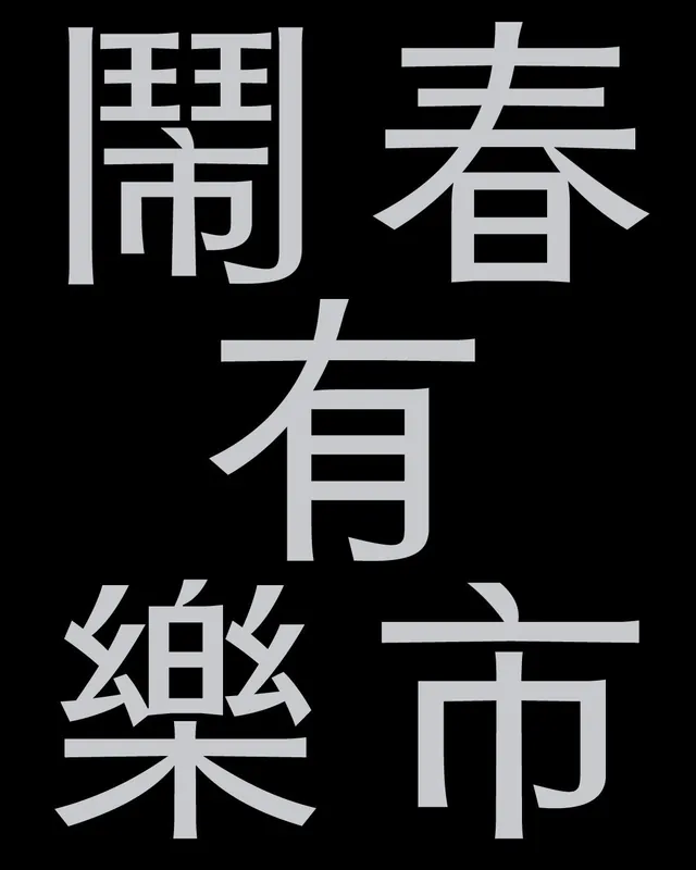
Traditional Chinese characters rendered in a bold monochromatic serif display, stacked vertically on a black background to create a formal, austere type specimen.
Summary
A stark monochromatic typeface specimen showcasing six Chinese characters in a formal serif style, stacked vertically and centered on a black field.
Visual description
Six traditional Chinese characters are positioned in a vertical stack, centered on a pure-black background. Each character is rendered in a medium gray-white serif typeface with generous stroke weight and clean geometric proportions. The characters occupy the full height of the frame with ample breathing room on all sides. The serif forms are pronounced, with bracketed serifs lending classical weight to the letterforms. The overall effect is austere and formal, emphasizing the architectural structure of each character rather than any ornament.
Key takeaway
The vertical stacking convention emphasizes the traditional reading direction and creates formal hierarchy through arrangement. The serif treatment gives contemporary geometry to classical characters, bridging historical and modern aesthetics. The generous negative space and monochromatic treatment make the typeface readable at any scale.
Reuse notes
Ideal for editorial, publishing, or cultural institutions seeking formal, tradition-aware typography. The vertical composition works for printed signage, posters, or digital type showcases. Not recommended for small text or UI use; best deployed as headlines or display elements. The monochromatic treatment is timeless and works in both light and dark layouts.
More like this





Keep what you find
A free account saves references to boards and can send you a weekly email of picks based on what you save.
To see every result, go Pro.