Preview image. Unlock full-res
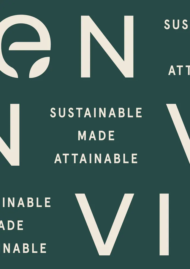
A cropped brand poster pairing a leaf-mark wordmark with the centered, all-caps stacked tagline 'SUSTAINABLE MADE ATTAINABLE' in cream on deep forest green.
Summary
A two-color brand composition on deep forest green: a circular leaf logomark sits top-left while the tagline "SUSTAINABLE MADE ATTAINABLE" reads centered in three stacked, letter-spaced all-caps lines. Oversized cream letterforms bleed off every edge to frame the lockup.
Visual description
The background is a single muted dark green. Cream-colored type does all the work in two scales. At full bleed, giant outline-clean capitals (E, N, V, I, parts of "MADE" and "AINABLE") run off the top, left, and bottom edges, partly cropped, acting as texture. Centered in the open middle is the tagline in a clean geometric sans, three short lines, each capitalized and widely letter-spaced for an even, calm rhythm. Top-left a circular mark with a negative-space leaf doubles as the brand's "e." There is no other ornament; contrast comes purely from the cream-on-green pairing.
Key takeaway
The figure-ground play of using the brand's own oversized letters, cropped at the canvas edge, as the background pattern behind a small, calm tagline. It gives a flat two-color layout depth and movement without any imagery or third color.
Reuse notes
Reach for this on sustainability, wellness, or natural-product brands that want to feel grounded and premium rather than loud. The cropped-letterform-as-texture trick works for posters, social tiles, and packaging; it needs a confident wordmark and only really sings in a restrained two-tone palette.
More like this




Keep what you find
A free account saves references to boards and can send you a weekly email of picks based on what you save.
To see every result, go Pro.