Preview image. Unlock full-res
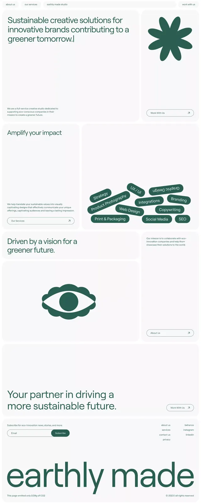
Teal and cream brand system for a sustainability-focused company using organic shapes and minimal typography to reinforce environmental values.
Summary
A minimal, modular brand identity for Earthly Made, emphasizing organic symbolism and environmental stewardship through teal tones and generous whitespace.
Visual description
Vertical layout on cream background with teal and forest-green accents. At top, six-pointed organic star shape and hand-drawn leaf cluster. Middle sections feature modular text blocks with supporting copy and left-aligned sans-serif headings separated by ample whitespace. An eye symbol (closed, organic) anchors the lower-middle section. Bold sans-serif heading "Amplify your impact" at mid-point. The wordmark "earthly made" appears large at bottom in dark serif-inflected type. Clean, spacious composition with consistent alignment and three-column text structure throughout. Soft, natural color palette dominated by creams, muted greens, and dark teal.
Key takeaway
Organic geometric marks (star, leaf, eye) as identity anchors without becoming illustration-heavy. Restrained serif/sans mixing (serif wordmark, sans body copy) that reads contemporary yet grounded. Modular, block-based layout that works as both a presentation and a systems foundation.
Reuse notes
Strong for mission-driven, sustainability-focused, or nonprofit brands. The organic symbol set works well for environmental or wellness verticals. High whitespace makes this suitable for premium or editorial positioning. The modular blocks adapt easily to variable content and layouts.
More like this



Keep what you find
A free account saves references to boards and can send you a weekly email of picks based on what you save.
To see every result, go Pro.