Preview image. Unlock full-res
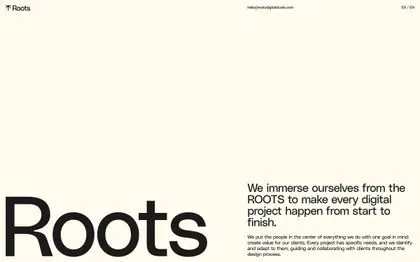
Cream-toned agency landing screen pairing a giant lowercase 'Roots' wordmark in the lower-left corner with a right-aligned mission statement and tiny top nav.
Summary
A studio landing screen on a warm cream ground where an oversized lowercase "Roots" wordmark sits flush to the bottom-left corner, balanced against a short right-aligned mission paragraph.
Visual description
The screen is a single warm off-white field. A thin top bar carries a small leaf-mark plus "Roots" wordmark at far left, a contact email centered, and a tiny "EN / EN" language toggle at right. In the lower half, the headline "We immerse ourselves from the ROOTS to make every digital project happen from start to finish" is set right-aligned in dark near-black sans-serif, with a smaller paragraph of body copy stacked beneath it. The dominant element is the word "Roots" rendered in huge lowercase letters anchored to the bottom-left edge, its descenders running off-canvas. Generous empty space fills the upper-left quadrant.
Key takeaway
The corner-anchored giant wordmark, cropped so it bleeds off the bottom edge, doing all the brand work while the rest of the page stays quiet. Pairing one oversized lowercase word against a small right-aligned copy block creates strong diagonal tension without any imagery.
Reuse notes
A good template for a design studio or freelancer landing page where the name itself is the hero. Works best on a warm neutral ground; the look depends on disciplined negative space, so resist adding a graphic. Pairs with a minimal sticky nav and a single understated CTA.
More like this





Keep what you find
A free account saves references to boards and can send you a weekly email of picks based on what you save.
To see every result, go Pro.