Preview image. Unlock full-res
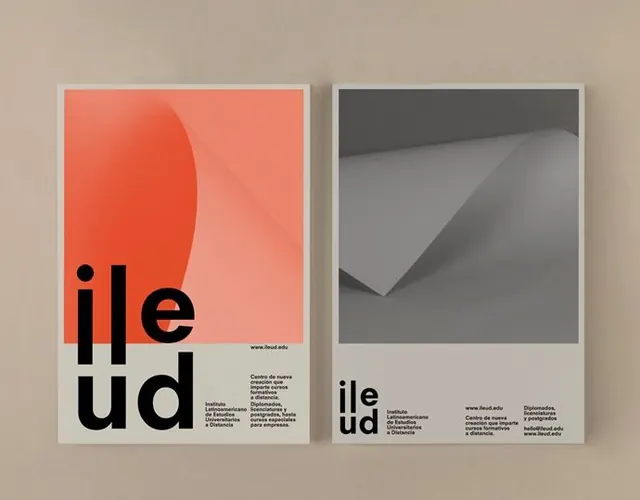
Pair of printed posters for an institutional identity, one coral with an abstract paper-fold element, one grayscale, both anchored by an oversized black lowercase wordmark.
Summary
Two A-format posters demonstrating a unified institution identity: left side coral with a gradient paper-fold render, right side grayscale with a folded-corner photograph, both anchored by the same oversized black ileud wordmark.
Visual description
The left poster is a coral-orange ground occupying the upper two-thirds, holding a smooth abstract gradient blob that reads as a three-dimensional folded sheet. A white band spans the bottom, where the wordmark ileud is split into two stack lines (ile / ud) in heavy lowercase letters, with a justified multi-column Spanish institutional text block and URL aligned to the right. The right poster mirrors the composition in grayscale: a photographic close-up of a crisply folded white paper corner replaces the abstract render, same white lower band, same black stacked wordmark. Throughout both sheets, typography is a clean, modern geometric sans-serif; the wordmark is substantially larger than the supporting text, creating deliberate scale hierarchy. The mockup shows both sheets photographed on a beige linen surface.
Key takeaway
Anchor a flexible system on a single element (here the oversized wordmark baseline) that holds the same position on every variant. Demonstrate the system working across unrelated visual content (a gradient render vs. a sharp photograph) by keeping the lockup position, scale, and supporting-information grid consistent. One accent color (coral) applied asymmetrically proves the palette without saturating either sheet.
Reuse notes
Suitable for education institutions, cultural organizations, or government agencies needing a flexible poster or cover series. The template works when imagery changes (photography, illustration, generated graphics) as long as the wordmark and info-block grid remain fixed. The coral-plus-neutral pairing is easily substitutable with any brand primary and its nearest neutral. Works at A2 down to A4; stack or grid copies for campaigns without redoing the system.
More like this




Keep what you find
A free account saves references to boards and can send you a weekly email of picks based on what you save.
To see every result, go Pro.