Preview image. Unlock full-res
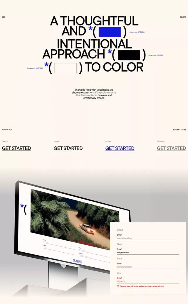
A cream editorial landing page where an oversized headline about color is punctuated by bracketed color-swatch placeholders, paired with a desktop mockup and a contact form below.
Summary
An editorial landing-page concept built around a color system, where the big headline literally embeds bracketed color-swatch placeholders inline with the type. The bracket-and-asterisk markers are the defining move.
Visual description
The top half is a left-to-right ragged headline in heavy black sans-serif on a warm cream ground: "A THOUGHTFUL AND INTENTIONAL APPROACH TO COLOR." Two of the lines have inline filled rectangles set inside parentheses, one solid blue and one solid black, standing in as swatch slots, each tagged with a tiny blue asterisk and a faint annotation. A short centered paragraph of fine print sits mid-page. Below a thin rule, four "GET STARTED" labels show interaction states (Default, Hover, Active, Disabled) running across the width. The lower third is a monitor mockup showing a dark palm-tree photo with a parenthesis-and-asterisk graphic, overlaid by a white contact form with labeled fields and a small blue submit button.
Key takeaway
Embedding live color swatches directly inside the headline as bracketed inline objects, so the type itself demonstrates the color system it describes. Also the asterisk-plus-parenthesis as a recurring annotation mark that ties headline, mockup, and form together.
Reuse notes
Strong for a design studio or brand presenting a color or design-system service, or a portfolio hero. Pairs well with a single accent hue against a neutral paper ground. The bracket motif needs to be used consistently or it reads as clutter.
More like this





Keep what you find
A free account saves references to boards and can send you a weekly email of picks based on what you save.
To see every result, go Pro.