Preview image. Unlock full-res
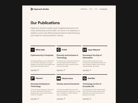
Editorial 'Our Publications' landing page on warm cream, listing six fictional publications in a three-column grid each with its own black geometric mark.
Summary
A cream-toned editorial landing page headed "Our Publications" that arrays six distinct publication sub-brands in a three-column grid, each fronted by its own small black geometric logo mark.
Visual description
A boxed cream content panel sits on a near-black page border. A top navbar carries the "Paperwork Studios" wordmark with a small icon at left, plus right-aligned links and an underlined "Subscribe". A large dark serif-feeling sans headline "Our Publications" leads, followed by a short muted intro paragraph. Below, a thin horizontal rule opens a 3x2 grid: each cell pairs a small solid-black geometric glyph (a distinct mark per title) with a bold publication name, a few lines of grey body copy, and a "Learn More" link with an up-right arrow. The whole system stays strictly black-on-cream with generous whitespace.
Key takeaway
The idea of giving every item in a directory grid its own miniature logo mark, so a list of names reads as a family of sub-brands rather than plain text. The single warm cream plus pure black palette and the repeated "Learn More" arrow link keep six varied cells visually unified.
Reuse notes
Strong template for a studio, publisher, or holding company that needs to present a portfolio of named products or imprints. Pairs well with a quiet navbar and a one-paragraph mission intro. The cream-and-black restraint reads premium but needs genuinely distinct marks per cell to earn its keep.