Preview image. Unlock full-res
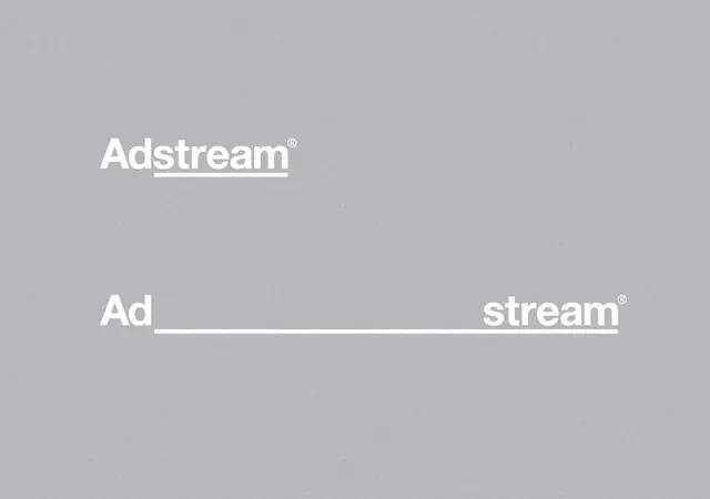
Corporate advertising platform wordmark shown in stacked and split-line compositions against neutral gray.
Summary
Corporate advertising platform wordmark presented in two typographic treatments: stacked full-word at top, and split across a horizontal line at bottom.
Visual description
Against a neutral light-gray background, "Adstream" appears twice in white sans-serif type. The upper treatment shows the full word stacked in a single centered block with a trademark symbol. Below, the same word is split: "Ad" on the left, "stream" on the right, separated by a thin white horizontal rule that runs the full width and slightly beyond the text. The arrangement is perfectly centered and symmetrical, with generous whitespace on all sides.
Key takeaway
The split-word layout as a flexible identity system that can adapt to horizontal constraints while staying typographically pure. The understated horizontal line creates visual separation and rhythm without introducing secondary marks. The monochromatic treatment ensures legibility and professional gravity at any size.
Reuse notes
Ideal for B2B software and advertising tech brands where trust and clarity are paramount. The split-word approach is particularly effective for responsive design, adapting from stacked to horizontal layouts. The minimal color palette works across all backgrounds and media. Best suited to conservative, corporate verticals.