Preview image. Unlock full-res
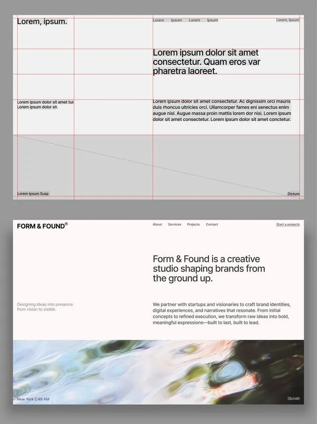
Two stacked screens for the Form & Found creative studio, a red-line grid wireframe with lorem ipsum above and the finished cream-toned homepage hero with an iridescent water image below.
Summary
A two-panel web design presentation stacked vertically on grey. The top panel is the underlying layout: a column grid drawn in thin red guide lines, blocked out with grey placeholders and lorem ipsum. The bottom panel is the resolved homepage for "Form & Found", a creative studio, with real copy and an iridescent water hero image.
Visual description
Top screen: a four-column red-line grid with red margin and baseline rules, big and small lorem ipsum headings, grey tonal blocks, and a faint diagonal line crossing the lower section, the scaffolding behind the design. Bottom screen: an off-white near-pink page. A slim navbar reads FORM & FOUND with a registered trademark superscript, center links (About, Services, Projects, Contact) and an underlined "Start a projects" at right. The hero headline "Form & Found is a creative studio shaping brands from the ground up." sits in a clean sans, with a two-line vision note at lower left and a paragraph of body copy at right. A full-width iridescent oil-on-water photo with a "(Scroll)" cue and a "New York 2:49 AM" timestamp closes the panel.
Key takeaway
Showing the red grid wireframe directly above the finished screen as a single artifact, which sells the rigor behind the result and is itself a strong portfolio device. The cream-pink page ground instead of plain white warms an otherwise austere Swiss layout. A smeary iridescent water image is a cheap, abstract, on-trend way to add motion-ready texture without literal imagery.
Reuse notes
Use for a design-studio or agency homepage, or as a case-study slide pairing process and outcome. The grid-over-final treatment also works as a "how we build" explainer. Pair the warm-neutral ground with one expressive full-bleed texture. Caveat: the wireframe panel reads as deliberate design language here; only present it that way when the audience values process, otherwise it looks unfinished.
More like this



Keep what you find
A free account saves references to boards and can send you a weekly email of picks based on what you save.
To see every result, go Pro.