Preview image. Unlock full-res
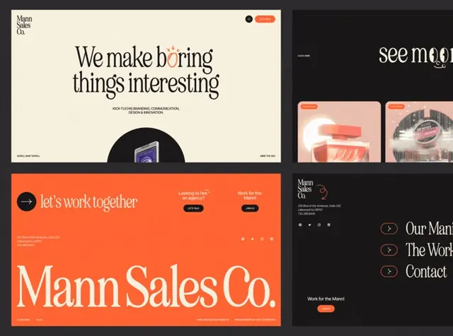
Dynamic brand identity for Mann Sales Co. with burnt-orange hero sections, cream typography, and modular layout system spanning corporate and digital applications.
Summary
A B2B sales brand using saturated burnt-orange and warm cream as the primary palette, with darkly-contrasted website mockups and clean sans-serif typographic hierarchy.
Visual description
A composite showing brand application across web and digital contexts. The top left features a cream background page with dark serif and sans-serif headlines, a rounded button element, and black circular accents. An orange bar on the far right shows modern website mockups. The bottom orange section contains the oversized "Mann Sales Co." logotype in white, paired with a left-facing arrow icon and text reading "let's work together" in white sans-serif. Orange navigation and call-to-action buttons contrast against the burnt-orange field. A right panel shows darker variations including a black background with the same icon and serif typography, plus additional website mockup examples. Navigation breadcrumbs and section labels are present throughout in small sans-serif type.
Key takeaway
The burnt-orange color choice feels warm and confident without being juvenile, making it effective for B2B and consulting contexts. Pairing orange with cream rather than white softens the contrast while maintaining readability, creating a more sophisticated appearance. The consistent use of a single geometric icon across multiple color backgrounds shows how a simple mark can unify a diverse application palette.
Reuse notes
Strong fit for sales, consulting, or professional-services brands aiming for confident, approachable energy. The warm palette reads as less corporate than pure blacks and whites, making it suitable for service-based companies that want to feel both serious and human. Works especially well in digital applications where the orange saturates and stands out; print applications may require careful CMYK testing to preserve the warm tone.
More like this





Keep what you find
A free account saves references to boards and can send you a weekly email of picks based on what you save.
To see every result, go Pro.