Preview image. Unlock full-res
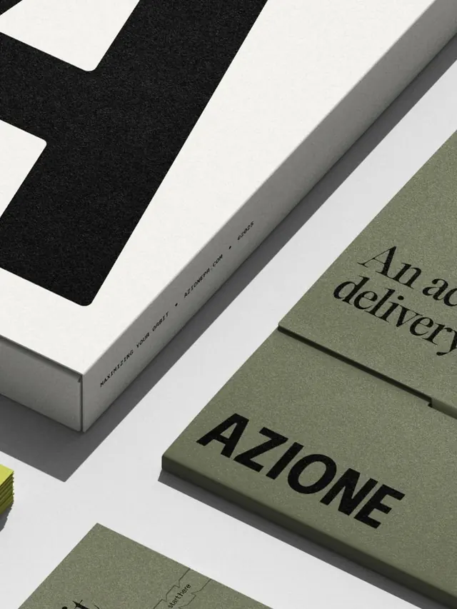
An angled flat-lay of AZIONE PR brand collateral mixing an oversized cropped letterform, a captioned mailer box, and sage-green folders set in a serif-plus-grotesque type system.
Summary
A tightly cropped, diagonally arranged flat-lay of a PR agency's print kit, built on a three-tone palette of sage green, cream and black and a deliberate serif-plus-grotesque type pairing.
Visual description
Pieces are shot from above on a pale grey surface and rotated to a shared diagonal. Top left, a cream box lid is cropped so a single massive black letter fills the corner as pure texture. Its edge carries a tiny tracked caption reading "MAXIMIZING YOUR ORBIT" with the domain "AZIONEPR.COM" and a date code, set in spaced uppercase grotesque. To the right, sage-green folders or cards layer in a staggered stack: one shows a serif headline beginning "An ad / delivery", another the wordmark AZIONE in heavy black grotesque caps, and a lower card carries a small line-drawn map fragment labelled "start here". A sliver of acid-yellow card edge peeks in at the far left, the only saturated note.
Key takeaway
Cropping a single brand letter to fill a corner turns the logo into background texture while the legible wordmark lives elsewhere. The serif-for-sentences, grotesque-for-the-name split keeps a two-typeface system feeling rich without clutter. Spaced-out micro-captions with a URL and date code add an editorial, archival stamp to plain collateral.
Reuse notes
A go-to mood for agency, fashion, or beauty-PR identity decks and case-study photography. Works best when one accent (here the yellow card) is held back to a sliver against the muted base. The diagonal flat-lay needs real printed pieces or convincing mockups to carry the material texture.
More like this





Keep what you find
A free account saves references to boards and can send you a weekly email of picks based on what you save.
To see every result, go Pro.