Preview image. Unlock full-res
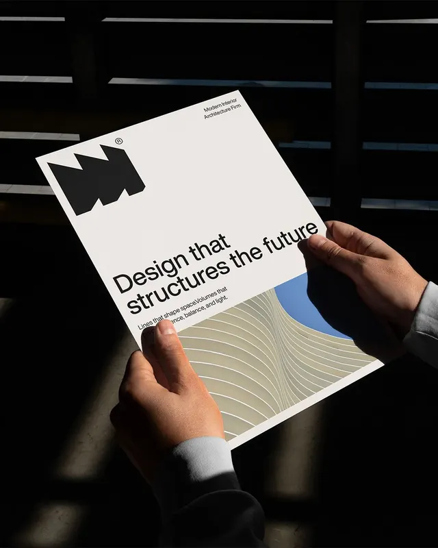
Swiss-minimal editorial brochure for a design firm, combining bold geometric iconography with structured typography and subtle wavy pattern details.
Summary
A design firm's editorial brochure on cream stock, combining a bold geometric icon and assertive headline typography with structured white space and warm-toned geometric patterns.
Visual description
White/cream rectangular publication held at an angle, featuring uppercase sans-serif headline "Design that structures the future" in black, left-aligned. Above the headline, a geometric black icon resembling an interlocked M and W shape with small trademark symbol. Lower half contains an abstract pattern of flowing horizontal wavy lines in tan, beige, and blue, creating subtle visual rhythm. The composition balances stark minimalism (white space, black type) with gentle geometric texture. Product photography showing the brochure in hand against a dark background with colored stripes above, suggesting interior design context.
Key takeaway
The integration of a tightly-drawn geometric mark with bold display type creates instant credibility. The lower-half pattern (wavy lines in muted colors) adds visual interest without overwhelming the clean typographic message. Swiss grid discipline applied to a color-minimal palette.
Reuse notes
Ideal for design firms, architecture studios, or consultancies seeking professional editorial materials. The icon-to-pattern hierarchy works well for showcasing a design philosophy or process. The cool-neutral palette and hand-holding photography convey craftsmanship and materiality; strong for B2B positioning.
More like this



Keep what you find
A free account saves references to boards and can send you a weekly email of picks based on what you save.
To see every result, go Pro.