Preview image. Unlock full-res
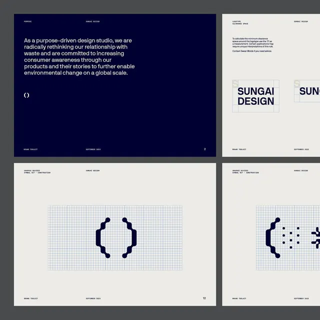
A modular brand identity toolkit for a sustainability-focused design studio, built on a navy and cream palette with grid-based geometric icons and rigorous typography rules.
Summary
A multi-page brand toolkit for Sungai Design, a sustainability-focused design studio, showing a navy and cream visual system built on modular geometry and restraint with mission statement, logo grid construction, and icon development guidelines.
Visual description
Four pages from a brand guideline document shown in a 2x2 grid. Top-left: a full-bleed navy page with white body text stating the studio's purpose around sustainable design and environmental responsibility, aligned left, with a geometric mark below. Top-right: a cream page titled "Logo Use" and "Dimensional Design" with minimal description text and two rectangular frames showing the Sungai Design logo rendered on a light grid construction guide. Bottom-left: another navy page labeled "Graphic Devices, Symbol Set, Construction" with an outlined geometric icon system shown on a light blue grid, displaying a stylized parenthesis-like shape and scatter of points. Bottom-right: partial view of another cream page with similar header treatment. Typography throughout is clean, all-caps sans-serif in varied weights for hierarchy. The color balance is sophisticated: navy dominates narrative moments while cream holds reference and grid systems.
Key takeaway
The discipline of a modular grid system applied to both page layout and icon construction, making geometry consistent across scales. The two-tone color block alternation (navy prose, cream systems) to distinguish editorial content from technical specification. The use of light-blue grid underlays to communicate construction logic without overwhelming the mark. The restraint in palette and typographic choices, allowing the grid geometry and negative space to do the visual work.
Reuse notes
Strong template for any design studio, agency, or creative practice that wants to communicate methodology alongside visual identity. The geometric icon approach works well in digital and print applications. Best suited for audiences that value process transparency and systematic thinking. The color palette and grid language pair well with sustainability or purpose-driven brand positioning. Requires a designer experienced with grid-based systems to customize, but the foundation is highly reusable.
More like this






Keep what you find
A free account saves references to boards and can send you a weekly email of picks based on what you save.
To see every result, go Pro.