Preview image. Unlock full-res
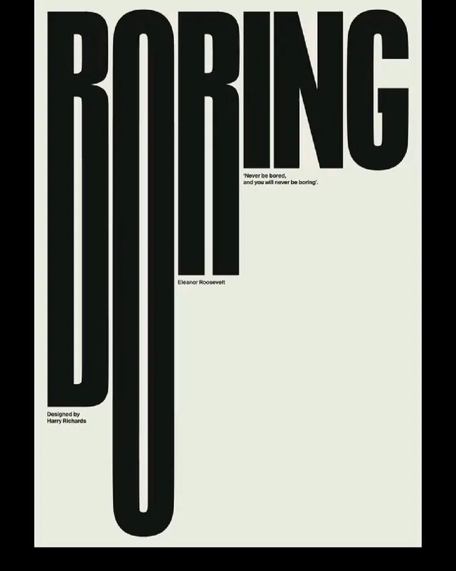
A typographic poster where the word BORING is stretched into towering ultra-condensed black letters against off-white, with small captions tucked into the negative space.
Summary
A single-word poster where BORING is set in a massively elongated, ultra-condensed black sans, the B and O descenders dropped almost the full height of the page so the headline reads twice, once across the top and again as long vertical strokes.
Visual description
The composition is vertical on a pale greenish off-white ground. The word BORING runs in heavy condensed caps across the top edge, then its B and O stems are deliberately stretched downward into two tall parallel bars that fall nearly to the bottom of the sheet, turning typography into a structural column. Tiny black sans captions are placed precisely in the surrounding void: a two-line pull-quote in single quotes mid-right, an attribution Eleanor Roosevelt below it, and a Designed by credit at lower left. Everything is pure black on the off-white with no color, no image, and vast empty space carrying most of the page.
Key takeaway
The descender-stretch move, taking a couple of round letterforms and pulling their stems far past the baseline so one word becomes both a headline and a vertical architecture. Pair that with crisp, tiny captions dropped into the empty zones to balance the giant mass and add a second reading speed.
Reuse notes
Reach for this when a single word or short statement is the whole message and you want maximum impact from type alone, posters, covers, title cards, brand statements. It needs a font that survives extreme vertical scaling and a lot of breathing room; cramming more content kills the effect. Monochrome keeps it austere and gallery-ready.
More like this





Keep what you find
A free account saves references to boards and can send you a weekly email of picks based on what you save.
To see every result, go Pro.