Preview image. Unlock full-res
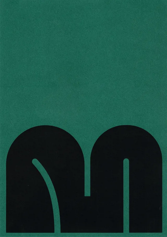
A single oversized lowercase letter m, built from two black rounded arches with thin negative-space slits, anchored at the bottom of a textured deep-green field.
Summary
A custom lowercase letter m rendered as two solid black rounded arches sitting at the base of a deep-green page, defined entirely by thin hairline slits of negative space.
Visual description
The mark occupies only the lower third of a portrait frame, leaving the top two thirds as empty green space. The letter reads as two fat semicircular humps joined into an m, with the stems thinning into a continuous black mass at the bottom. Two narrow curved cuts of green carve the counters: one is a near-straight tapering slit, the other a tighter hooked curve, giving the otherwise heavy form a hand-drawn asymmetry. The background is a flat forest green with a visible fine paper grain, and the black sits matte against it for strong figure-ground contrast.
Key takeaway
Carrying the entire identity on one heavily rounded display letter, then letting hairline negative-space slits do the detailing rather than outlines. Parking the mark low in the frame so the empty field above becomes part of the composition.
Reuse notes
A strong starting point for a single-letter monogram or app icon where you want weight and warmth at once. The hand-cut counters keep it from feeling like a default geometric font. Pairs well with muted earthy or jewel-tone backgrounds; the slits will close up and muddy if scaled down very small.