Preview image. Unlock full-res
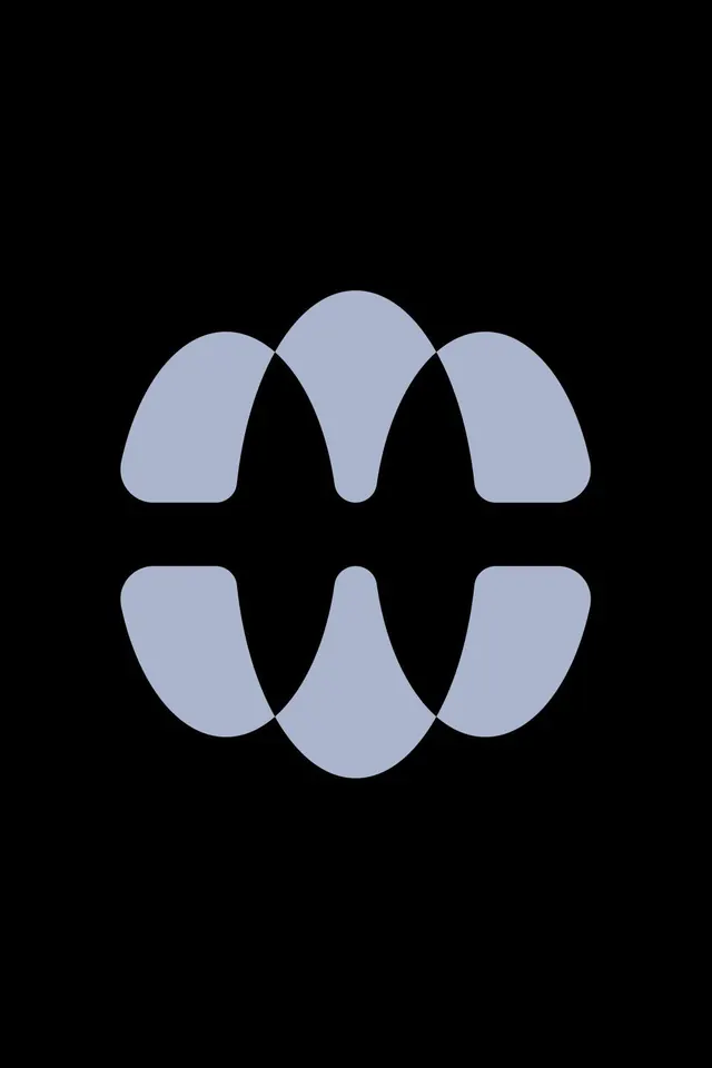
An abstract logomark in periwinkle blue-gray on black, built from six rounded petal-and-leaf shapes whose overlaps imply an enclosed botanical or floral form.
Summary
A single-color abstract logomark, periwinkle blue-gray on black, made of six soft petal-and-leaf forms whose overlapping points read as an enclosed floral or seed shape. The defining move is using the gaps between curves to suggest the form rather than drawing it outright.
Visual description
Centered on a tall black field, the mark sits in two mirrored rows of three rounded blade-like shapes. The upper row arches downward like petals, the lower row curves upward, and where the shapes meet they pinch into sharp points, leaving slivers of black negative space that imply a central enclosed body. Every form shares the same flat muted blue-gray fill with generous corner rounding, giving it a soft, organic-yet-geometric feel. Strong bilateral symmetry, no type, no gradient, no outline.
Key takeaway
Building a mark from a small set of one repeated soft blade shape, mirrored and rotated, so the meaningful figure appears in the negative space between forms. The rounded terminals keep an organic, friendly read inside an otherwise rigid grid.
Reuse notes
Good starting point for wellness, beauty, botanical, or calm-tech brands that want an abstract mark with a natural undertone. Reads cleanly as an app icon at small sizes because it is one flat color on a solid ground; test legibility once the petals shrink, as the negative-space figure can collapse.