Preview image. Unlock full-res
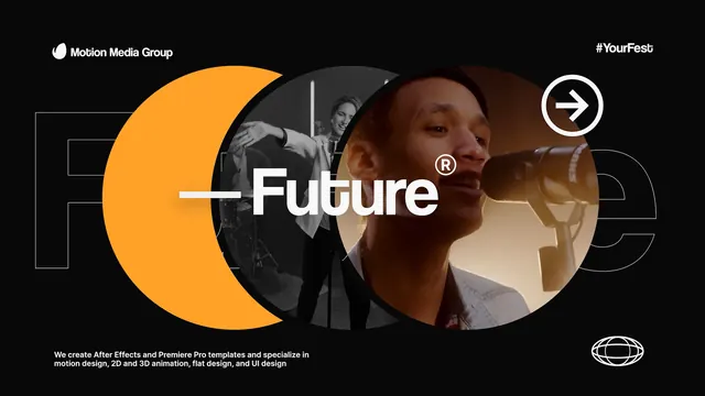
A dark design-agency hero featuring the headline 'Future' over a portrait, anchored by a large warm-orange circular shape and delicate geometric overlays on a black ground.
Summary
A design agency hero pairing the large word "Future" in white sans-serif with a portrait of a man, layered against a bold warm-orange circular shape and delicate geometric line work on pure black.
Visual description
A jet-black background holds a composition of overlapping geometric elements and a central portrait. A large warm-orange filled circle occupies the upper-left-to-center area, serving as a bold color anchor. To the right is a photograph of a man in profile, cropped at the shoulders. The word "Future" in large, white, modern sans-serif is positioned center-left, with a registered trademark symbol superscript. Around the headline and portrait are thin white lines forming subtle rectangular and circular borders, creating depth layers without overwhelming the composition. At top left, small white text reads "Motion Media Group" and at top right a hashtag "#YourFesto". Bottom right carries two circular icon marks. A small line of footer copy runs along the bottom.
Key takeaway
The single warm accent circle against black is a powerful, economical design move that commands attention without noise. Layering geometric line work (thin rules and borders) behind the type and portrait creates dimensionality without clutter. The composition balances a bold photograph with clean typography by letting both breathe; the geometric shapes act as visual glue, not container. The oversized sans-serif headline is confident but not aggressive, reinforced by the small caps and registered trademark.
Reuse notes
Excellent template for any agency, studio, or tech-forward brand positioning itself as innovative and approachable. The dark background works best when photography inside it is warm and well-lit; a cool-toned portrait would fight. The orange accent is strong; most brands would swap in their own primary color. The thin geometric lines work as a style signature; refine them to match your grid logic. Apply to hero sections, case-study covers, or credentials pages. Works on desktop; mobile would benefit from simplifying the geometric overlay.