Preview image. Unlock full-res
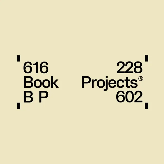
Asymmetrically arranged typography presenting alphanumeric codes, divided into two aligned columns with decorative corner marks anchoring each quadrant.
Summary
Asymmetrically arranged typography presenting alphanumeric codes, divided into two aligned columns with decorative corner marks anchoring each quadrant.
Visual description
Two distinct information blocks arranged off-center on a warm cream background: "616 Book B P" left-aligned on the left, "228 Projects 602" right-aligned on the right, with a registered trademark mark tucked into the "Projects" line. Bold, sans-serif numerals dominate in a condensed weight. Small black rectangular marks sit in the upper left and lower right corners of the composition, functioning as architectural registration marks. The tight spacing between characters and the stark contrast between letterforms and the off-white ground emphasize precision and clarity.
Key takeaway
The use of corner registration marks as a structural device anchoring a composition. The asymmetric but balanced split of alphanumeric information, leveraging white space and edge alignment to create visual order. The interplay between extremely bold type and minimal marking, establishing authority without ornament.
Reuse notes
Strong reference for identifier systems, corporate branding guidelines, and editorial layouts valuing institutional clarity. Works well when paired with photography or content that can fill the white space. The mark placement signals a project-management or cataloging context, suitable for portfolio systems, design archives, or structured information design.
More like this







Keep what you find
A free account saves references to boards and can send you a weekly email of picks based on what you save.
To see every result, go Pro.