Preview image. Unlock full-res
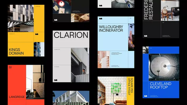
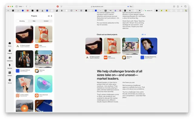
A modular editorial spread displaying ten architectural and design projects in an asymmetric grid, mixing photography, flat color blocks, and bold typography in black, white, yellow, and blue.
Summary
Portfolio editorial layout presenting ten architecture and design projects in a modular, asymmetric grid that alternates between photography, solid color blocks, and sans-serif project titles in a restrained palette of black, white, grey, yellow, and light blue.
Visual description
A dense, multi-panel composition covering roughly a 3x4 spread. Each panel is a self-contained project module approximately square or near-square in proportion. Projects include: a bold yellow vertical slab on the left (Kings Domain, text in black sans-serif); a black panel with Clarion branding in minimal grey type and white photography of built environments; a pale blue architectural panel (Willoughby Incinerator) with small color photographs and black sans-serif captions; a cream/grey architectural photograph (Freery Stud); a red/cream panel with navigation graphics (Langridge); blue panels with the Cleveland Rooftop project name. The grid uses consistent guttering and alternates between full-bleed photography, flat color, and text-heavy layouts. All typography is clean, left-aligned sans-serif in black or white depending on background. Color accents (yellow, blue) are used strategically to direct eye movement and create visual rhythm.
Key takeaway
The pairing of geometric color-blocking with documentary photography creates depth and breaks monotony without clutter. Consistent sans-serif typography across all projects unifies the spread despite variety in image treatment. The yellow and blue accent colors are used sparingly but effectively to highlight key projects and anchor the eye. The asymmetric grid feels dynamic yet organized because of consistent gutter spacing and proportional relationships.
Reuse notes
Highly effective for showcasing a mixed portfolio of architectural, design, or creative projects. Works equally well as a printed editorial spread or a responsive web layout. The color-blocking strategy allows weak photography to coexist with strong photography without compromise. Best paired with narrow, condensed sans-serifs for project titles and generous whitespace around text. Replicable for agencies, architecture firms, and design studios showcasing client work.
More like this






Keep what you find
A free account saves references to boards and can send you a weekly email of picks based on what you save.
To see every result, go Pro.