Preview image. Unlock full-res
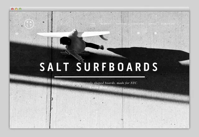
A minimalist website hero featuring a black-and-white photograph of a surfer mid-action with a surfboard, overlaid with the brand name and tagline.
Summary
A website hero section for a surfboard brand, featuring a striking black-and-white photograph of a surfer in mid-jump with an overhead view, with bold "SALT SURFBOARDS" branding and navigation menu overlaid.
Visual description
Full-width browser mockup with grayscale photography of a surfer captured mid-action, jumping with board overhead. The composition includes a textured wood-grain background with natural lighting and shadows creating depth. The "SALT" logo (circular wordmark) appears in the top-left corner. A horizontal navigation menu spans the top right with options: HOME, THE CONCEPT, DIMENSIONS, ONLINE STORE, CONTACT, BELOW THE LINE. Large all-caps "SALT SURFBOARDS" headline is centered with a thin horizontal line underneath. Below sits italic sub-copy: "Quality progressively shaped boards, made for NYC. Learn More."
Key takeaway
Uses dramatic, authentic action photography to establish brand credibility for a high-end product. The monochrome treatment creates a cohesive, premium aesthetic while allowing the photography to dominate. The sparse typographic overlay respects the imagery without competing.
Reuse notes
Strong reference for sports/lifestyle brands seeking to showcase products through authentic action. The minimalist text treatment works when the photography is dynamic and specific. Best suited for hero sections of marketing or e-commerce sites. The grayscale approach unifies disparate photographic elements and conveys sophistication.
More like this


Keep what you find
A free account saves references to boards and can send you a weekly email of picks based on what you save.
To see every result, go Pro.