Preview image. Unlock full-res
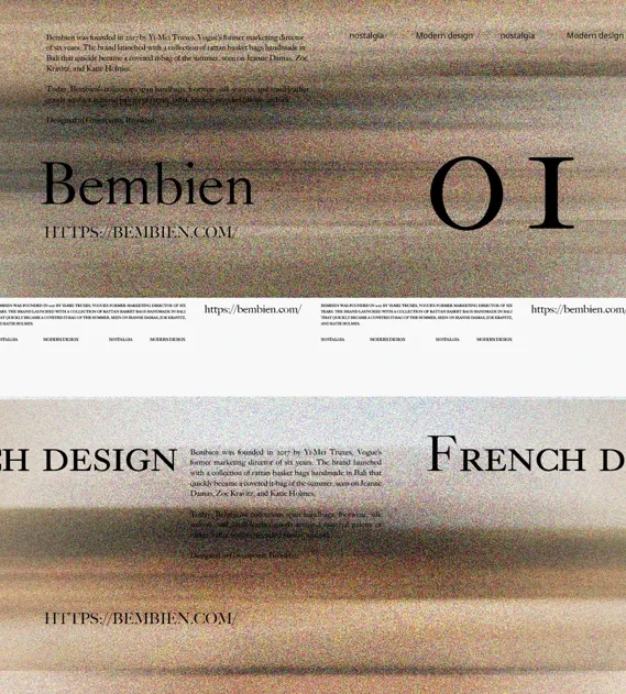
A minimal luxury type specimen pairing the serif typeface with muted earthtone swatches and restrained layout, suggesting artisanal or fashion branding.
Summary
A type specimen for the Bemben serif family, showing the typeface name and "FRENCH DESIGN" tagline alongside muted earthtone color swatches on a clean, cream background.
Visual description
The composition is sparse and horizontal. At left, the serif typeface displays "Bemben" as the primary text block in caps and italics with generous letter-spacing, followed by smaller "FRENCH DESIGN" below. To the right are thin rectangular color swatches in a muted palette: warm taupes, soft beiges, and dark browns, stacked vertically with subtle texture overlay. The entire specimen is centered on a light cream ground with ample white space, evoking a luxury fabric or fashion lookbook aesthetic.
Key takeaway
The minimal specimen format pairs type sample with a curated, functional color story rather than arbitrary imagery. The use of swatch texture (not solid color) grounds the palette in a tangible, tactile context. The combination of serif display with warm earthtone palette reads as timeless and approachable, not cold.
Reuse notes
Excellent template for fashion, beauty, or lifestyle brands seeking a sophisticated type system. The earthy palette maps well to natural, artisanal, or sustainable narratives. The French design callout adds cultural specificity; adapt language to match brand origin.
More like this
Keep what you find
A free account saves references to boards and can send you a weekly email of picks based on what you save.
To see every result, go Pro.