Preview image. Unlock full-res
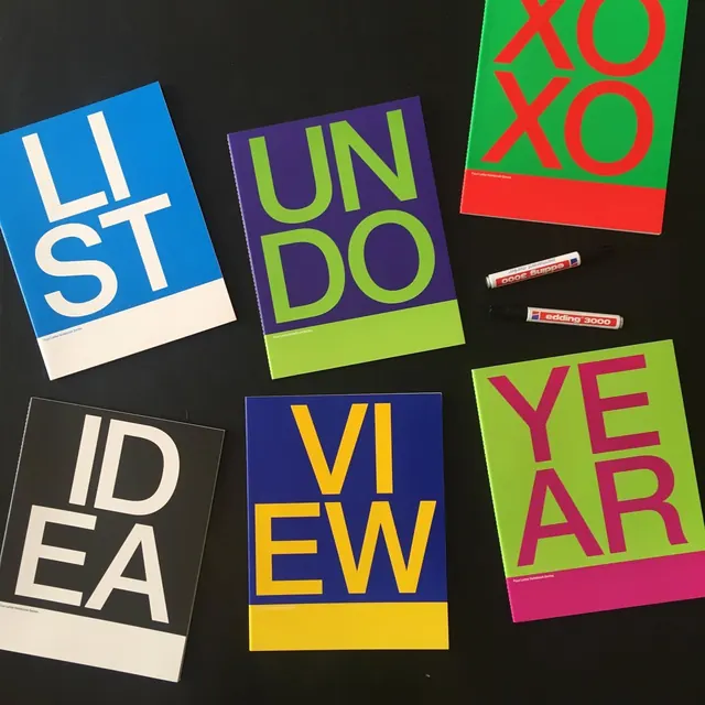
A dark flat-lay of six notebook covers from a Four Letter Notebook Series, each printing one four-letter word in two stacked rows of bold caps over a saturated color block.
Summary
A photographic flat-lay of six physical notebooks fanned on a black surface, each cover a different bright color and stamped with a four-letter word (LIST, UNDO, XOXO, IDEA, VIEW, YEAR) split into two stacked pairs of huge caps.
Visual description
Six perfect-bound notebooks are arranged loosely on a matte black tabletop in a roughly two-row grid, each tilted at a slight angle so the layout feels relaxed rather than gridded. Every cover follows one system: a solid saturated field (cobalt, indigo, lime, charcoal, deep blue, magenta) with the title word set in a heavy sans and broken across two lines of two letters each, the type sitting in a contrasting hue, and a thin "Four Letter Notebook Series" caption near the foot. A pale band crosses the lower portion of several covers. Two red Edding 3000 permanent markers rest between the books at center as a styling prop, anchoring the flat-lay.
Key takeaway
A single rigid template (one color block, a four-letter word stacked two-by-two, a small series caption) recolored across a whole set to build a recognizable family. The two-up letter stacking that turns short words into a bold square graphic. Using a real prop in the flat-lay to set scale and add life.
Reuse notes
A model for any modular product line, stationery, packaging, or a poster series, where a fixed grid plus a swappable palette is the brand. Lean on it when you want variety and unity at once. Constrain titles to four letters (or pad with a consistent layout rule) so the two-by-two stack always holds. Shoot on a dark surface to make the colors pop.
More like this




Keep what you find
A free account saves references to boards and can send you a weekly email of picks based on what you save.
To see every result, go Pro.