Preview image. Unlock full-res
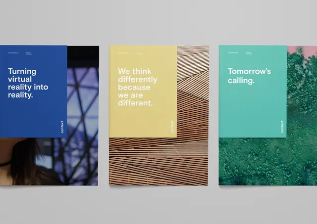
Three identity presentations paired with layered abstract textures, balancing bold editorial typography against wood grain and linear stripe patterns.
Summary
Three-part brand identity study pairing bold editorial headlines with organic textural overlays (wood grain, linear stripes), unified by a restrained, earthy color system.
Visual description
Three vertical card-like spreads arranged side by side. The left panel is a deep blue ground with a large photograph fragment behind the headline "Turning virtual reality into reality", featuring window shadows. The center panel pairs pale yellow typography ("We think differently because we are different") with a dense linear-stripe texture pattern in warm tan and white, filling the lower two-thirds. The right panel presents "Tomorrow's calling" in soft cyan-green, anchored by a rich photograph of green foliage bleeding into the bottom edge. All three use flush-left, bold sans-serif headlines in 2-3 lines with generous leading. The overall composition is grid-aligned and editorial, emphasizing the interplay between typography and abstracted material texture rather than illustration or photography.
Key takeaway
The discipline of pairing text only with one material texture (stripes, wood grain, photo) rather than layering many elements. The muted earthy palette (teal, beige, tan, warm wood tones) creates sophistication without contrast. The oversized single-color typography on textured grounds is a strong pattern for publication design and brand systems.
Reuse notes
Strong reference for editorial or media brands, design system documentation, and luxury lifestyle publications. Works well at large formats and on print collateral. The texture-as-background approach is especially effective when the texture itself has cultural or material meaning (wood = craft, stripes = modernism). Avoid if the audience expects photographic or illustration-forward design.
More like this







Keep what you find
A free account saves references to boards and can send you a weekly email of picks based on what you save.
To see every result, go Pro.