Preview image. Unlock full-res
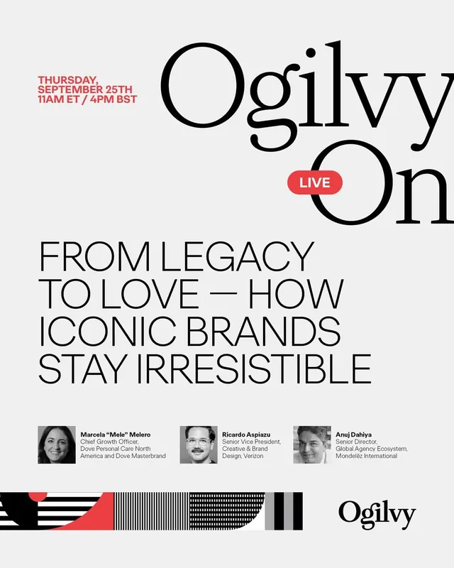
A minimalist event poster for an Ogilvy live session combining oversized serif and sans-serif headlines, speaker headshots, and abstract linear pattern elements in black, white, and accent red.
Summary
A live event poster for Ogilvy's "Ogilvy On" session titled "From Legacy to Love: How Iconic Brands Stay Irresistible," featuring stacked serif and sans-serif headlines, three speaker portraits with credentials, a red "LIVE" badge, and a footer pattern of black, white, and red geometric stripes.
Visual description
Light gray background (almost off-white). Top left: date and time in small red sans-serif capitals ("THURSDAY, SEPTEMBER 25TH 11AM ET / 4PM BST"). Center-right: the main title "Ogilvy On" in enormous black serif type with distinctive circular letter forms (O, g). A red pill-shaped badge reading "LIVE" overlaps the descender of the g. Below: the session theme "FROM LEGACY TO LOVE / HOW ICONIC BRANDS STAY IRRESISTIBLE" in tall, narrow black sans-serif (all caps), left-aligned. Further down: three horizontally arranged grayscale headshots (Marcela "Mele" Melero, Ricardo Aspiazu, Anuj Dahiya) with their titles and affiliations in small black sans-serif. Bottom edge: a horizontal footer pattern stripe combining solid red, white, black, striped, and dotted pattern blocks. Bottom right: the Ogilvy wordmark in black serif. The design achieves authority through black-and-white austerity with a single red accent breaking the formality, drawing the eye to the "LIVE" tag.
Key takeaway
The juxtaposition of a serif display typeface (Ogilvy On) with sans-serif body copy creates visual hierarchy without needing multiple sizes or weights. The oversized circular serifs and flowing letterforms of the serif headline contrast elegantly with the geometric precision of the title and speaker text. The footer pattern adds visual interest and brand personality to an otherwise austere layout. The red accent (LIVE badge) is minimal but effective, priming the viewer for broadcast.
Reuse notes
Effective for corporate events, conference announcements, and brand-led content series. The serif/sans pairing works well for media and consulting brands wanting sophistication and authority. The pattern footer is a nice way to inject brand color or texture without dominating the layout. Can scale up or down; the core principle is the hierarchical type contrast and the restrained use of accent color.
More like this





Keep what you find
A free account saves references to boards and can send you a weekly email of picks based on what you save.
To see every result, go Pro.