Preview image. Unlock full-res
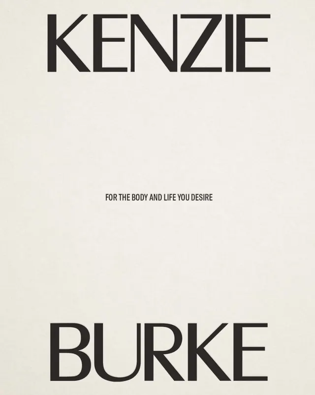
A stark typographic specimen showing two stacked sans-serif brand names in all-caps separated by small secondary text on a cream background.
Summary
A stark typographic specimen showing two stacked sans-serif brand names in all-caps separated by small secondary text on a cream background.
Visual description
Two brand names rendered vertically on a pale cream background: "KENZIE" at the top and "BURKE" at the bottom, both in a clean, geometric sans-serif typeface at large scale. Between them, centered and minimal, sits the text "FOR THE BODY AND LIFE YCULPTURE" in a much smaller size, creating a clear hierarchy. The typeface is rigid and modern, with even letterforms and minimal stroke variation. The high contrast between black text and cream ground emphasizes the typography without any supporting graphics, color, or texture.
Key takeaway
The vertical, two-name structure creates a sophisticated pairing identity without additional logowork. The dramatic scale shift between main names and secondary text controls hierarchy through size alone. The minimal serif-less sans-serif and cream ground convey editorial refinement and fashion sensibility.
Reuse notes
Strong model for luxury brand identities, fashion, or heritage brands needing composed sophistication. Works in applications requiring clear name hierarchy (parent + sub-brand, or complementary brand names). Relies entirely on typography, so the typeface choice is critical. Reads editorial and aspirational rather than tech or casual.
More like this






Keep what you find
A free account saves references to boards and can send you a weekly email of picks based on what you save.
To see every result, go Pro.