
Preview image. Unlock full-res
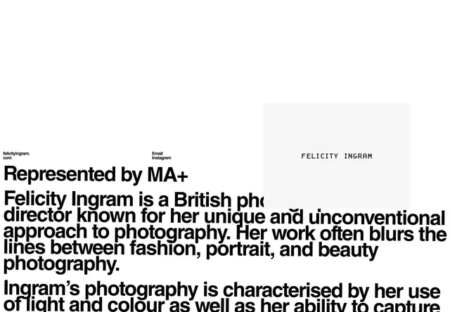
Large-scale sans-serif body text on light gray background with minimal header attribution, demonstrating typography as primary visual language.
Summary
Type specimen showing large-scale body-text rendering of 'Inspiring corners of the web you should see' in sans-serif on light gray background, with minimal metadata header, demonstrating editorial typography layout.
Visual description
A light gray background fills the frame. At the top left, a small-scale header reads 'Design inspiration' with '@studio.baseline' to its right. The primary visual element is a large-scale headline-weight sans-serif text reading 'Inspiring corners of the web you should see,' positioned in the vertical center and left-aligned. The typeface is clean, modern, and optimized for readability at display scale. Black text on neutral gray provides high contrast. No images, no decorative elements. The layout relies entirely on generous vertical whitespace above and below the text to establish visual hierarchy and breathing room.
Key takeaway
The discipline of using type and whitespace as the complete visual system: a minimal header establishes context, then the typeface at scale becomes the entire design. The composition proves that a sans-serif specimen needs no additional ornament or color to command attention. The left-aligned body text is editorial in approach, not corporate.
Reuse notes
Reference for portfolio and editorial sites that want to lead with typography. Works well for design studios, publications, and type foundries showcasing display-size readability. The centered whitespace strategy emphasizes the typeface itself rather than a brand narrative. Best for web and screen display where the size and contrast can be properly appreciated.
More like this



Keep what you find
A free account saves references to boards and can send you a weekly email of picks based on what you save.
To see every result, go Pro.