Preview image. Unlock full-res
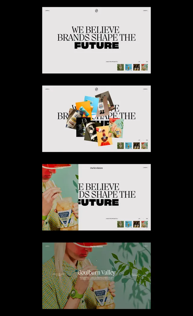
Four-panel editorial series repeating the headline over varied photographic and textured imagery with minimal grid layout.
Summary
A four-frame promotional campaign repeating the headline "WE BELIEVE BRANDS SHAPE THE FUTURE" over varied photographic and textured backgrounds, unified by a clean minimal grid layout.
Visual description
Four horizontal cards stack vertically, each holding the same declarative headline in bold, display sans-serif at the top left. Each card pairs the text with a different visual: the top frame shows a modernist building facade with stenciled letters, the second overlays colorful fragmented photographs in a collage, the third pairs the text with a lush green botanical photograph, and the bottom frame displays a solid color field (sage green). All frames share the same proportions, white/cream background, and small stacked colored icons (square shapes in various shades) aligned to the bottom right. The typography is weighty, modern, and slightly compressed, emphasizing word breaks across lines for visual rhythm.
Key takeaway
The stacked-frame series format creates a campaign feel without repetitive variation: each frame is distinct but immediately readable as part of a set. The pairing of bold declarative text with minimal, often incidental imagery (rather than perfectly matched stock photos) gives the work a thoughtful, editorial quality. The color icon system at the bottom right is functional (differentiating each card) while staying minimal and refined.
Reuse notes
Strong template for corporate positioning campaigns, brand manifestos, and marketing series where a single message needs to feel grounded and multifaceted. Works best in digital carousel contexts or printed as a poster series. The imagery can be sourced from brand photography, texture libraries, or conceptual/abstract photography without losing coherence. Minimal color variation keeps the work feel cohesive; reserve color saturation for accents only.
More like this







Keep what you find
A free account saves references to boards and can send you a weekly email of picks based on what you save.
To see every result, go Pro.