Preview image. Unlock full-res
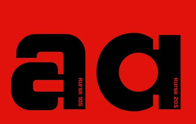
Two bold black letterforms (reading as 'GI') with geometric apertures and cutouts, rendered on a saturated red background in a stark, confident identity mark.
Summary
Two monolithic black letterforms set against a vivid red ground, each built from geometric shapes and negative cutouts, conveying authority and institutional confidence through pure contrast.
Visual description
Saturated red background (approximately #DF130B) occupies the entire frame. Two very large black letterforms dominate the composition, occupying roughly two-thirds of the visible area. The first letter (appearing to be 'G') features a curved spine with geometric negative space cut through its body, creating visual breathing room and preventing the form from feeling too heavy. The second letter (appearing to be 'I' or a serif-less form) also incorporates a geometric rectangular aperture. Both letters use a heavily weighted, nearly monolinear sans-serif with only subtle variations in stroke thickness. The type appears to be a custom or specialized geometric sans, constructed from basic shapes. Small vertical text runs down the right side of each letter (possibly "HURSK 105" and "HURSK 205"), presumably indicating a typographic classification or product code. The composition is perfectly centered and symmetrical, with nothing but the type and the saturated background.
Key takeaway
The aperture technique (cutting geometric negative space through heavy letterforms) makes monolithic type feel less brutal and more refined. The red/black contrast is immediate and memorable, reading well at distance and in small reproduction. The symmetry and centered lockup create an unmistakable, institutional presence suitable for educational or corporate contexts.
Reuse notes
Ideal as the primary mark for schools, universities, or serious corporate identities where confidence and clarity matter more than approachability. The single-color palette simplifies signage, embroidery, and application across vehicles or architecture. The high contrast can appear stark in soft-touch applications (business cards, stationery); pairs better with large-scale environmental or digital deployment. Not recommended for healthcare, hospitality, or consumer brands seeking warmth.
More like this




Keep what you find
A free account saves references to boards and can send you a weekly email of picks based on what you save.
To see every result, go Pro.