Preview image. Unlock full-res
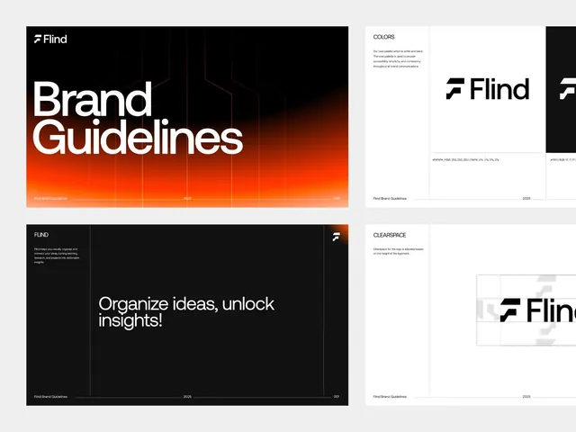
Flind brand guidelines showcasing a dark and orange color palette, grid-based layout, and bold sans-serif typography across cover, color, and clearspace specification pages.
Summary
Flind brand guidelines spanning cover, color specification, and logo clearspace rules across dark and white backgrounds with warm orange as the primary accent.
Visual description
Four pages from a brand-guidelines document. The cover spreads a white sans-serif headline "Brand Guidelines" over a dark background with a radial orange-to-black gradient occupying the lower third, creating a strong directional visual. The bottom includes small footer text reading "Flind Brand Guidelines" and dates. A dedicated colors page lists the palette (white, dark, orange tones, warm greys) with explanatory copy on the right. A clearspace page demonstrates minimum spacing around the Flind logo against both dark and light backgrounds using a subtle grid overlay. Throughout, clean monospace display type sits against generous negative space with dark greys and blacks dominating, punctuated by warm orange.
Key takeaway
The gradient background on the cover anchors the visual hierarchy without imagery. The color-specification page layout (text left, color swatches right) is reusable. The clearspace grid with clear measurements and both light/dark variants provides a practical reference model.
Reuse notes
Strong reference for tech-forward brand guidelines. The dark-background-with-warm-accent strategy works well for developer tools and SaaS. Copy the specification format (color page, clearspace page with grid) for your own guidelines. Works best when the accent color is genuinely bright (this orange reads well against dark).
More like this
Keep what you find
A free account saves references to boards and can send you a weekly email of picks based on what you save.
To see every result, go Pro.