Preview image. Unlock full-res
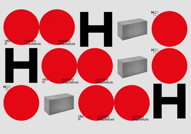
A geometric brand system for an architecture firm built from two primary elements: a boldface H letterform and large, saturated red circles, anchored by brutalist concrete-textured blocks.
Summary
A striking architectural brand system combining bold black H letterforms with oversized red circles and textured gray 3D cubes on a neutral background.
Visual description
The system is laid out as a grid showcasing multiple mark variations. The primary elements are: a chunky, geometric sans-serif H rendered in solid black with strong weight and presence; large, vibrant red circles (pure, saturated red) that overlap and stand alone; and gray concrete-textured rectangular blocks with realistic 3D rendering that suggest material and weight. The H appears in combinations with the circle and block elements, sometimes paired with the full "Humaro Arquitetura" wordmark in a compact, all-caps sans-serif. A minimal H water droplet logotype appears as a secondary mark. The light gray background provides maximum contrast for all elements. Typography is bold, clean, and strictly geometric.
Key takeaway
The confidence of using pure geometric shapes as primary branding elements. The monolithic boldness of the H as a brand anchor that can stand alone or integrate with supporting marks. The use of concrete texture and 3D rendering to suggest materiality and permanence (appropriate for architecture). The restraint in color palette (three colors) despite high visual impact.
Reuse notes
Strong model for industrial and architectural brands. The concrete texture is distinctive but specific to materiality verticals. The high-impact red works well for signal and authority; consider legibility in small applications. System shows clear primary, secondary, and supporting elements for scalable application.
More like this





Keep what you find
A free account saves references to boards and can send you a weekly email of picks based on what you save.
To see every result, go Pro.