Preview image. Unlock full-res
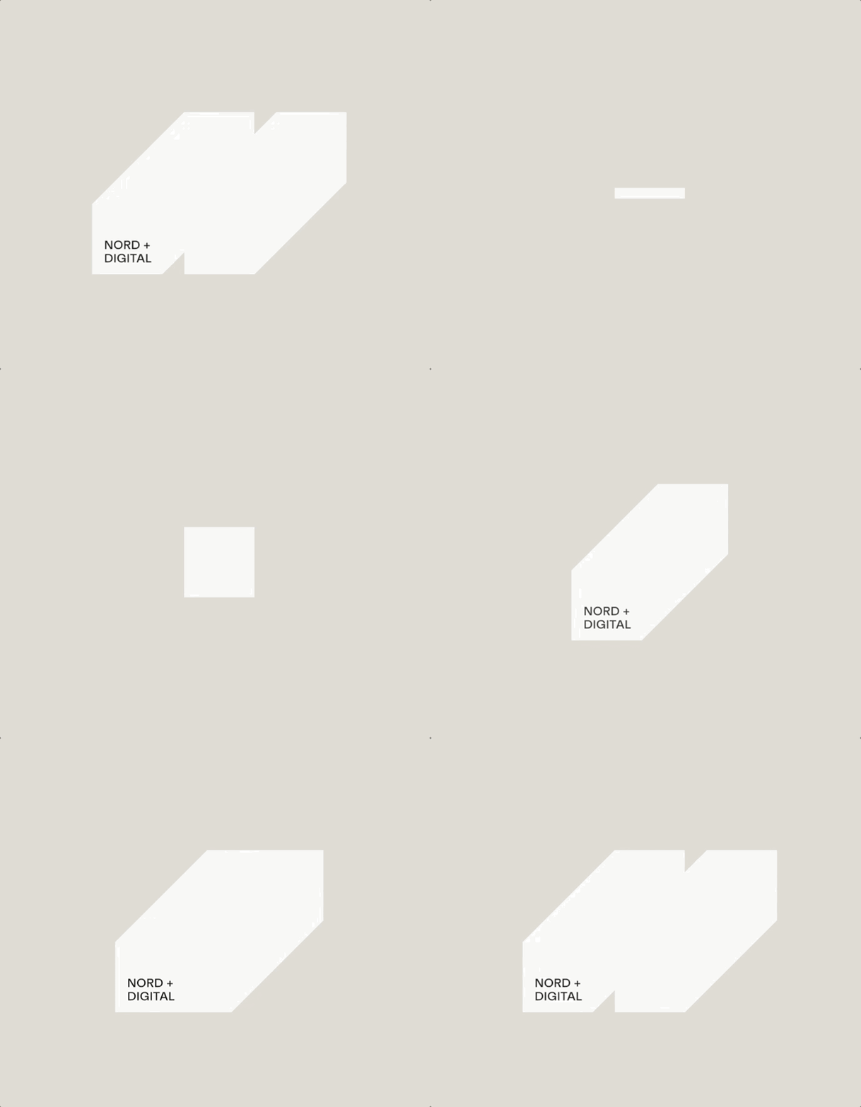
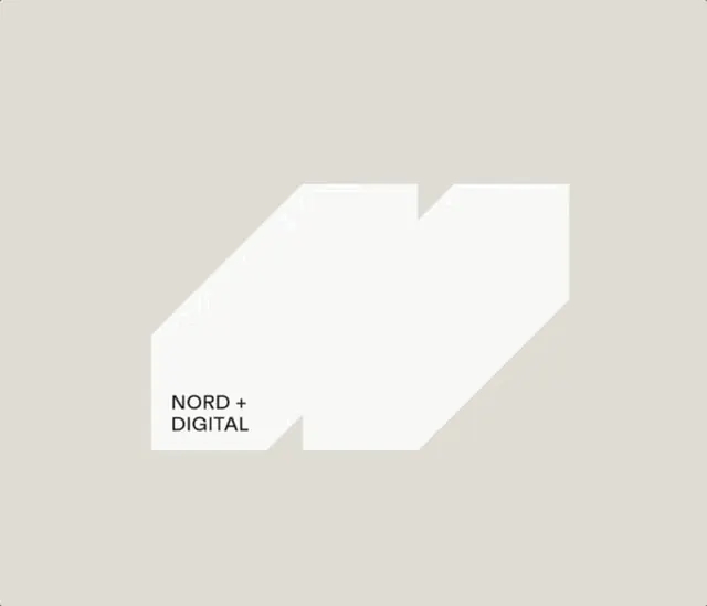
Nordic digital agency branding featuring a stark white geometric arrow/chevron form containing the brand name in clean sans-serif, set against warm beige background.
Summary
A digital agency's wordmark using a white geometric arrow/chevron form containing the text "NORD + DIGITAL" in sans-serif, cleanly set against a warm beige ground.
Visual description
Warm beige background with a large white geometric shape composed of three angular planes suggesting an arrow pointing right or a stylized chevron in 3D perspective. Inside the white form, the text "NORD + DIGITAL" appears left-aligned in a clean, medium-weight sans-serif, positioned in the lower-left quadrant of the shape. The sharp edges and isometric tilt of the white form create depth and forward momentum without any shadows or gradients, maintaining pure flatness. The composition uses generous negative space and high contrast between the white shape and warm ground to create visual clarity.
Key takeaway
A geometric wordmark container (arrow/chevron) that guides the eye through the brand name without overwhelming it. The isometric perspective adds sophistication without decorative excess. The high contrast beige-and-white palette reads legibly at any scale and adapts easily to other backgrounds.
Reuse notes
Ideal for tech, consulting, and digital-services brands seeking a premium, forward-facing identity. The geometric form pairs well with modern sans-serif typographies and works across print, digital, and presentation contexts. Test the wordmark on both light and dark backgrounds, as the white form may need reversal or outline treatment on dark grounds.
More like this




Keep what you find
A free account saves references to boards and can send you a weekly email of picks based on what you save.
To see every result, go Pro.