Preview image. Unlock full-res
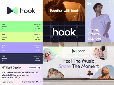
A product identity system for 'hook' displaying a geometric play button logo, a vibrant purple to lavender color palette, and lifestyle photography paired with typography.
Summary
A product identity system for 'hook' displaying a geometric play button logo, a vibrant purple to lavender color palette, and lifestyle photography paired with typography.
Visual description
A grid-based identity presentation in four sections. Top left: the 'hook' wordmark in sans-serif with a play button symbol (right-pointing triangle nested in an inverted triangle, rendered in bright lime green). Top right: a lifestyle photo of a smiling person against warm background with the tagline 'Lig to both, po dads' (text appears intentionally stylized or partially visible). Middle left: a secondary brand treatment reading 'Together with hook' in white on a dark purple-black background. Middle right: the same photo repeated with text 'Feel The Music, Share The Moment' overlaid. Bottom section: UI elements including a labeled color swatch system and type samples. The color palette alternates between white, soft purple, muted gray, dark indigo, and bright lime green, creating a cool but energetic identity.
Key takeaway
The play button logo functions as both mark and symbolic system element (communication-focused, music/media associations). The color palette bridges professional (muted purples, grays) with energy (lime green accent) without overwhelming. The grid layout organizes logo, color, type, and photography into distinct but unified zones.
Reuse notes
Effective for media, music, or content-sharing products. The cool purple palette with a single warm accent works across web and app interfaces. The lifestyle photography grounds the abstract geometric logo in a real use case. Avoid overusing the bright green as it can feel juvenile if applied too heavily.
More like this





Keep what you find
A free account saves references to boards and can send you a weekly email of picks based on what you save.
To see every result, go Pro.