Preview image. Unlock full-res
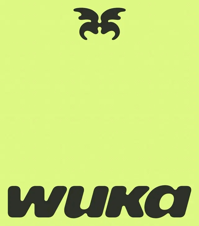
Minimalist branding system pairing a centred symmetrical black geometric symbol (stylized wings or horns shape) with a bold black word mark in a wavy, expressive typeface on vibrant lime-green background.
Summary
Minimalist branding system pairing a centred symmetrical black geometric symbol with an expressive black word mark on vibrant lime-green background, creating high-contrast visual identity.
Visual description
Full-bleed composition on uniform lime-green (#DDF883 or similar) background. Top half: large black geometric symbol, symmetrical and stylized, with curved angular shapes resembling wings, horns, or interlocked curves (looks like a badge or crest). Bottom half: bold black display typeface with a wavy, slightly irregular baseline spelling out "WUKA" or similar (the word mark). The thick, geometric sans-serif letterforms are rounded at terminals, giving the mark simultaneous weight and friendliness. Strong figure-ground contrast between black and lime ensures legibility at any scale.
Key takeaway
The symmetrical geometric symbol is immediately memorable and works equally well as an icon, avatar, or app badge. The expressive, slightly playful word mark (wavy baseline, rounded terminals) softens what could otherwise be stark geometric branding. The lime-green choice signals energy and modernity without feeling dated; paired with pure black it reads confidently on digital and print.
Reuse notes
Strong fit for consumer apps, energy brands, and tech startups wanting memorable mark recognition. The symbol works standalone at favicon size; the lockup scales from 16px to billboard. Lime-green is high-energy and high-contrast, so it dominates any context - reserve for brands that own boldness. Works best on dark or neutral backgrounds for the inverse; avoid busy or colorful backgrounds.