Preview image. Unlock full-res
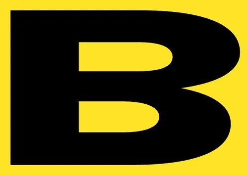
Minimalist logo for a Latin American urban architecture festival using bold black geometric shapes with rounded corners and bright yellow background.
Summary
A festival logo combining a bold black rounded-rectangle shape (resembling a pointer or exclamation mark) with yellow all-caps "TAC!" lettering, anchored by a secondary tagline identifying it as "Festival de Arquitectura Urbana" (Urban Architecture Festival).
Visual description
Centered on a bright, saturated yellow field. A primary black geometric mark composed of two rounded-corner rectangles: a larger left-pointing horizontal rectangle containing the all-caps sans-serif text "TAC!" in yellow with a serif-style horizontal stem/bar accent, and a smaller rounded rectangle positioned above-right containing smaller yellow text reading "Festival de Arquitectura Urbana" in a condensed sans-serif. The shapes have smooth rounded corners, creating a contemporary, friendly geometric abstraction. The intense yellow background and pure black foreground create maximum visual contrast and print legibility.
Key takeaway
The dual-zone composition that uses a single bold mark to establish both primary branding ("TAC!") and secondary context (festival category) without breaking visual hierarchy; the pairing of rounded geometric shapes with all-caps type for a confident, approachable event identity; the strategic use of extreme color contrast for outdoor festival visibility.
Reuse notes
Strong reference for event and festival identities, especially in architecture, design, or urban planning sectors. The simple two-color palette ensures reproducibility across media (print, signage, digital). Works best for bold, contemporary events targeting younger or creative audiences. The high-contrast yellow-black combination risks visual fatigue if overused as a full background; better suited for logo applications, posters, or accent elements.